
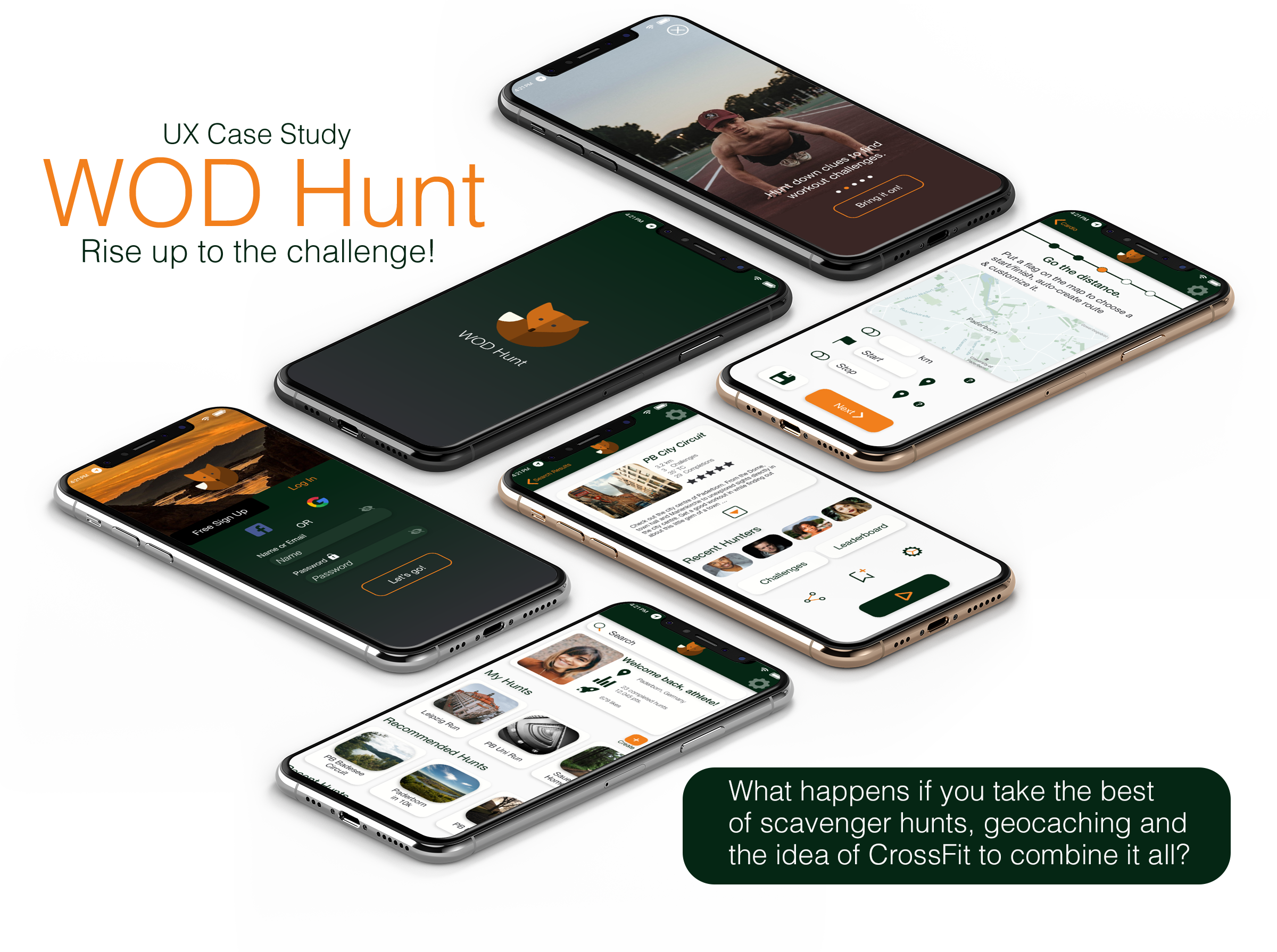
WOD Hunt
It's geo-caching fitness!
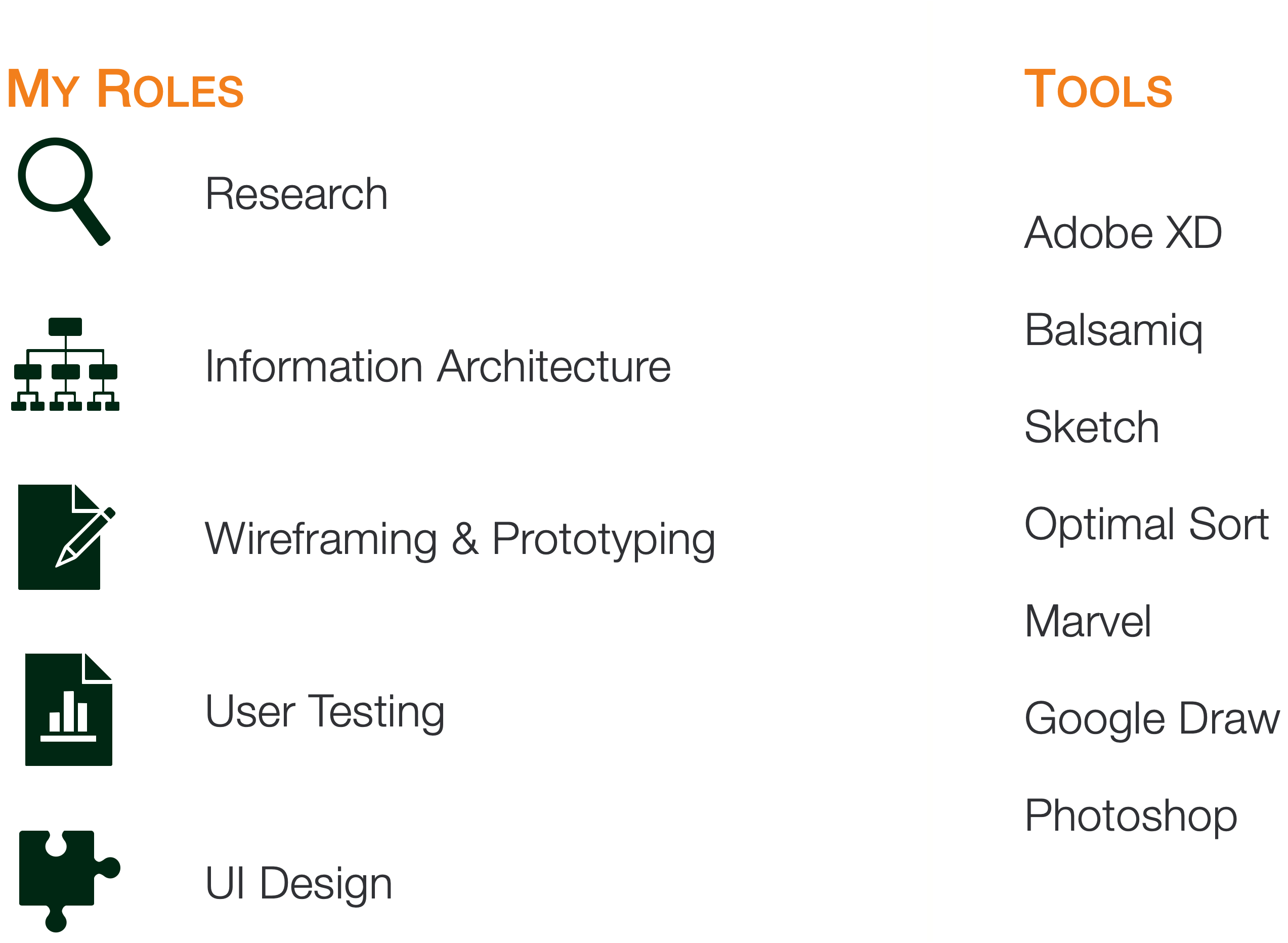
WODHunt is a responsive web app for CrossFitters and functional fitness athletes who want to use the principles of scavenger hunts and geocaching for their training regime. This case study presents the entire design process, via user research and usability testing up to a high-fidelity mockup of the mobile app using mainly Adobe XD.
Feel free to browse this site and if any questions arise, do not hesitate to contact me. Enjoy!
What he needs is WOD Hunt.
About
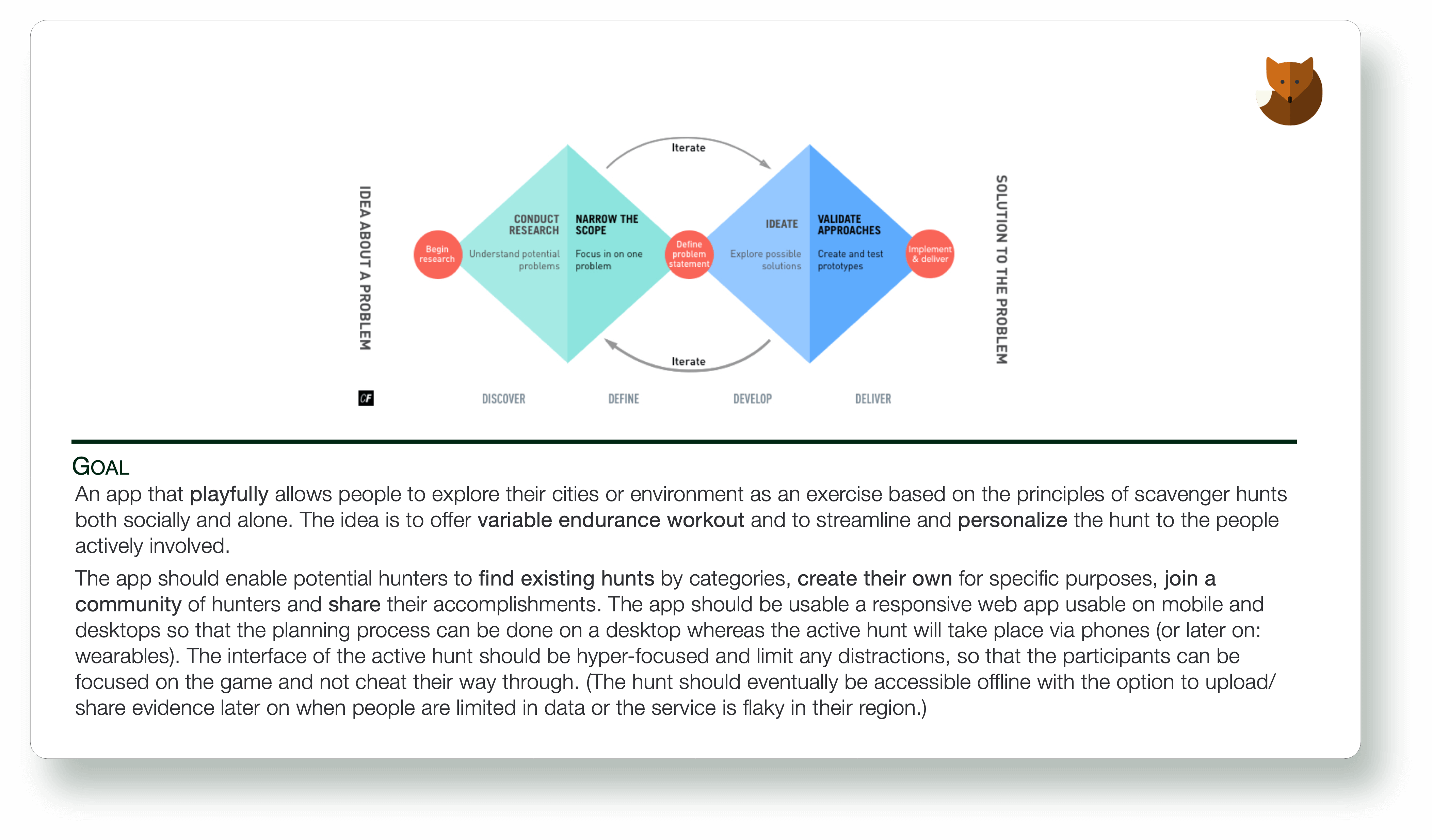
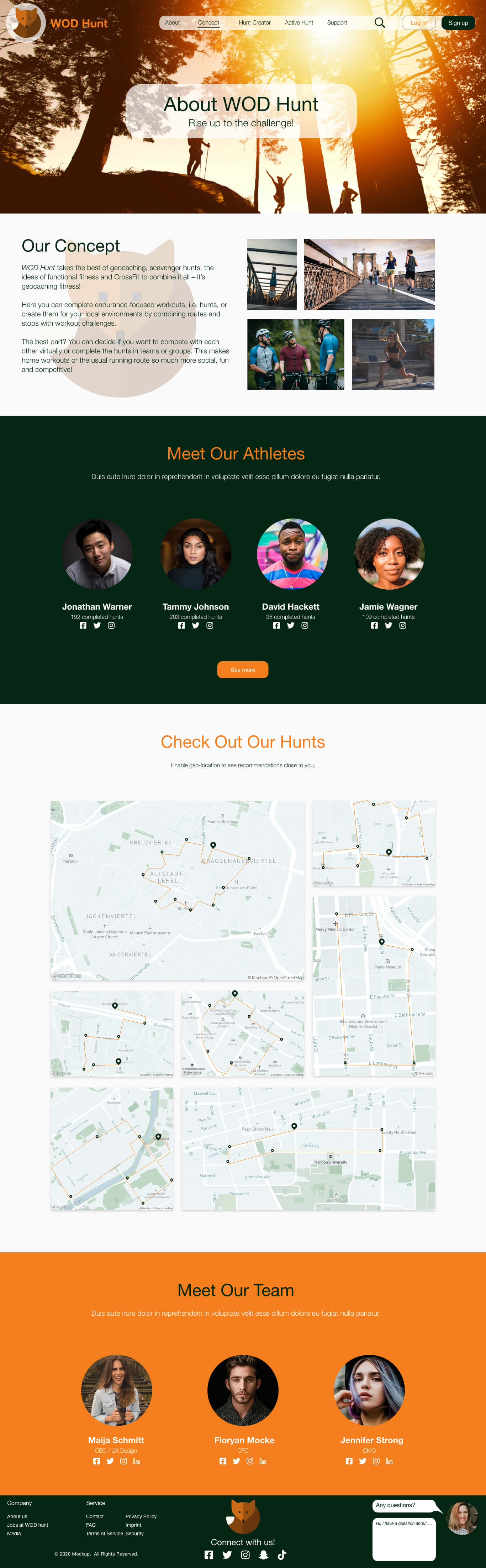
WOD Hunt is a responsive web application that takes the best of geocaching, scavenger hunts, the ideas of functional fitness and CrossFit to combine it all - it's geocaching fitness!
users can complete endurance-focused workouts, i.e. hunts, or create them for their local environments by combining routes and stops with workout challenges.
The best part: athletes can decide if they want to compete with each other virtually or complete the hunts in teams or groups. This makes home workouts or the usual running route so much more social, fun and competitive!
This project was completed during the CareerFoundry UX course and with the patient and insightful help of my tutor Matt Kollat and mentor Wojciech Hupert.
The Process
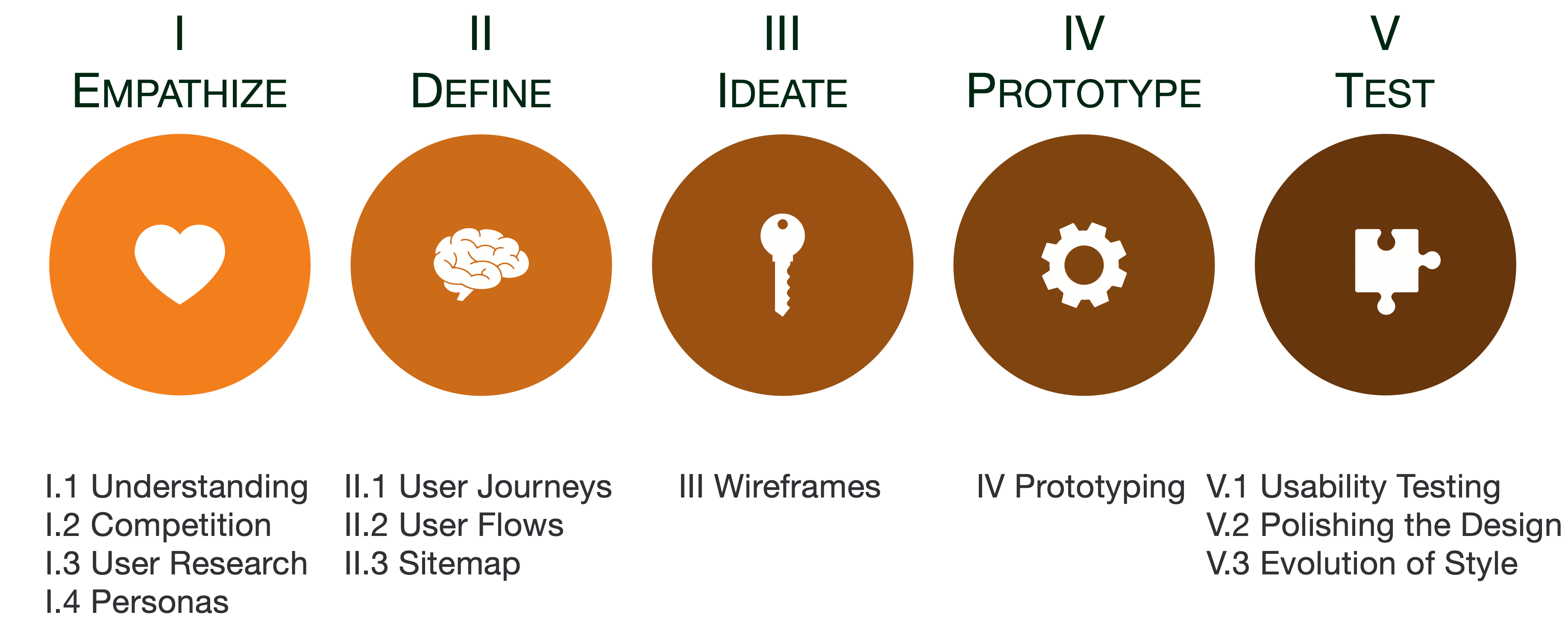
I Empathize
I.1 Understanding
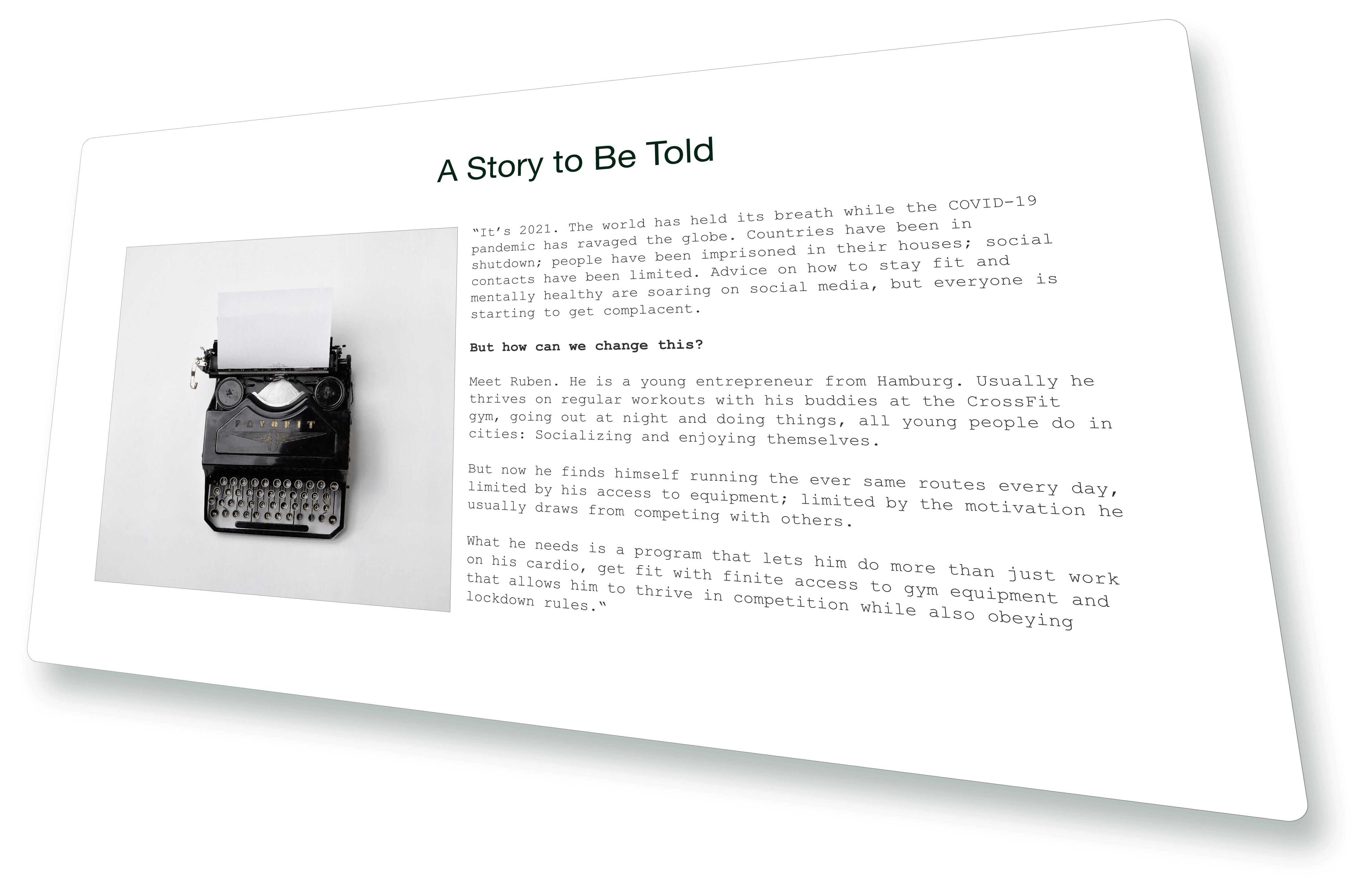
Let's step a few steps back.
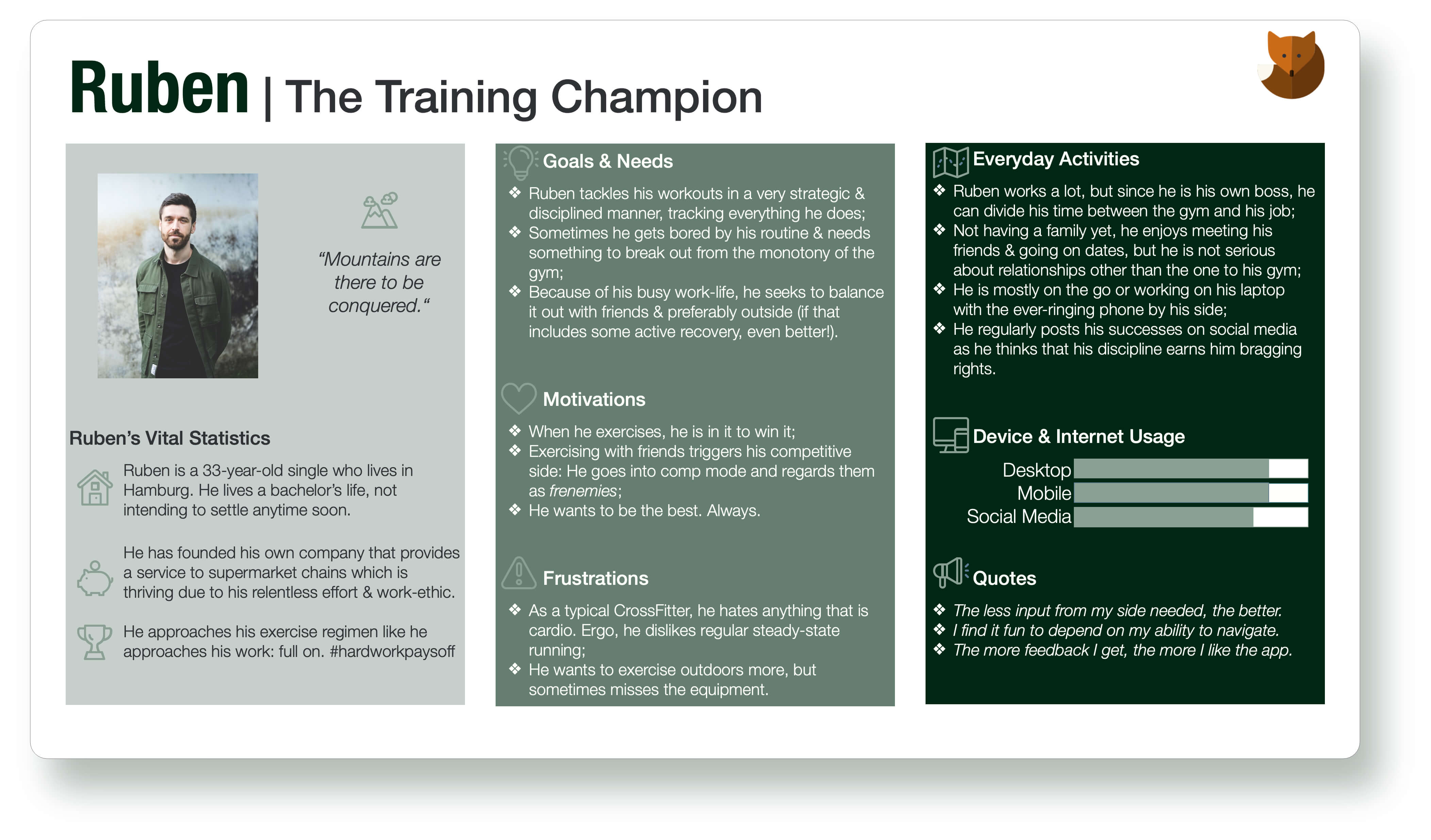
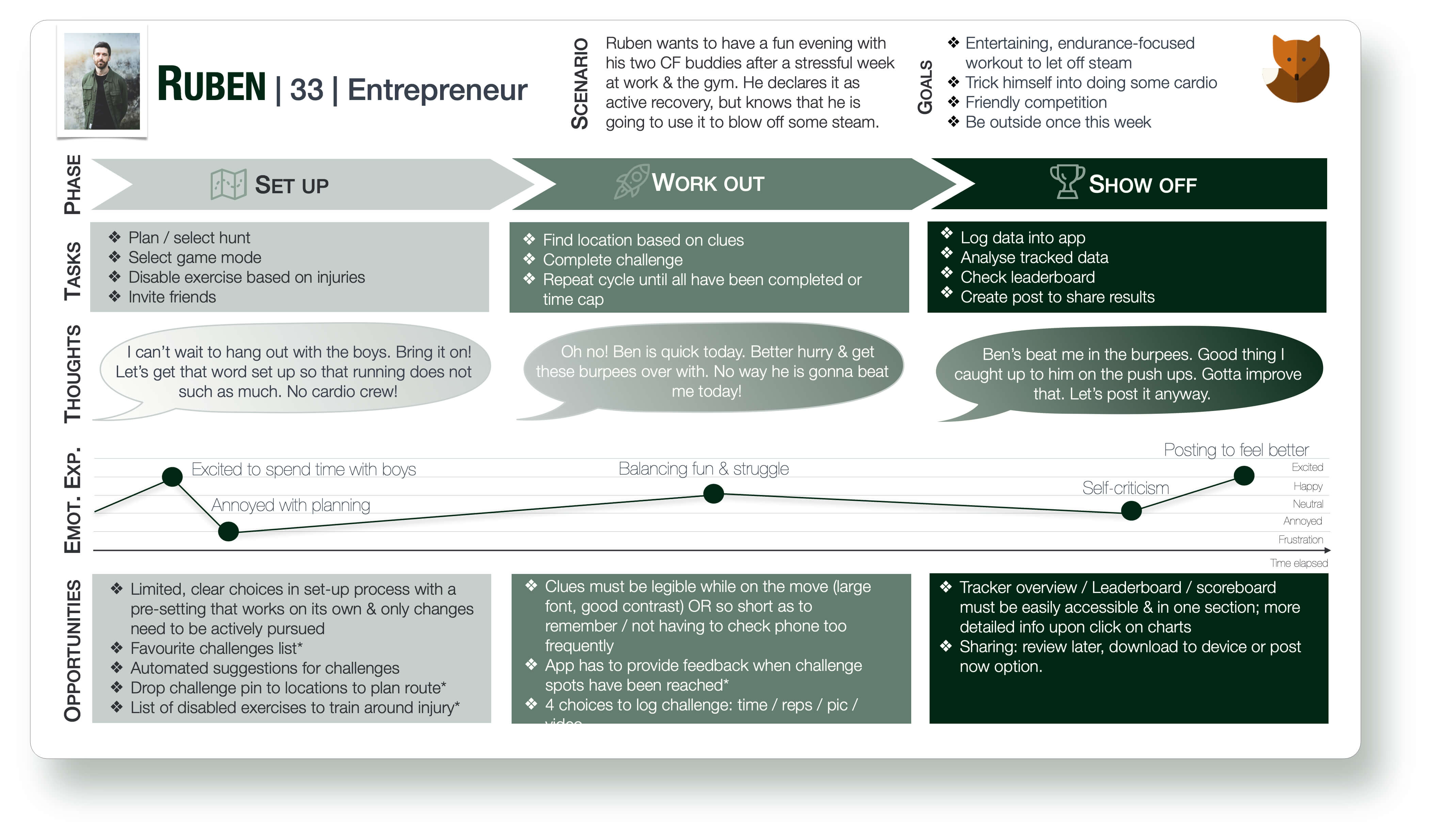
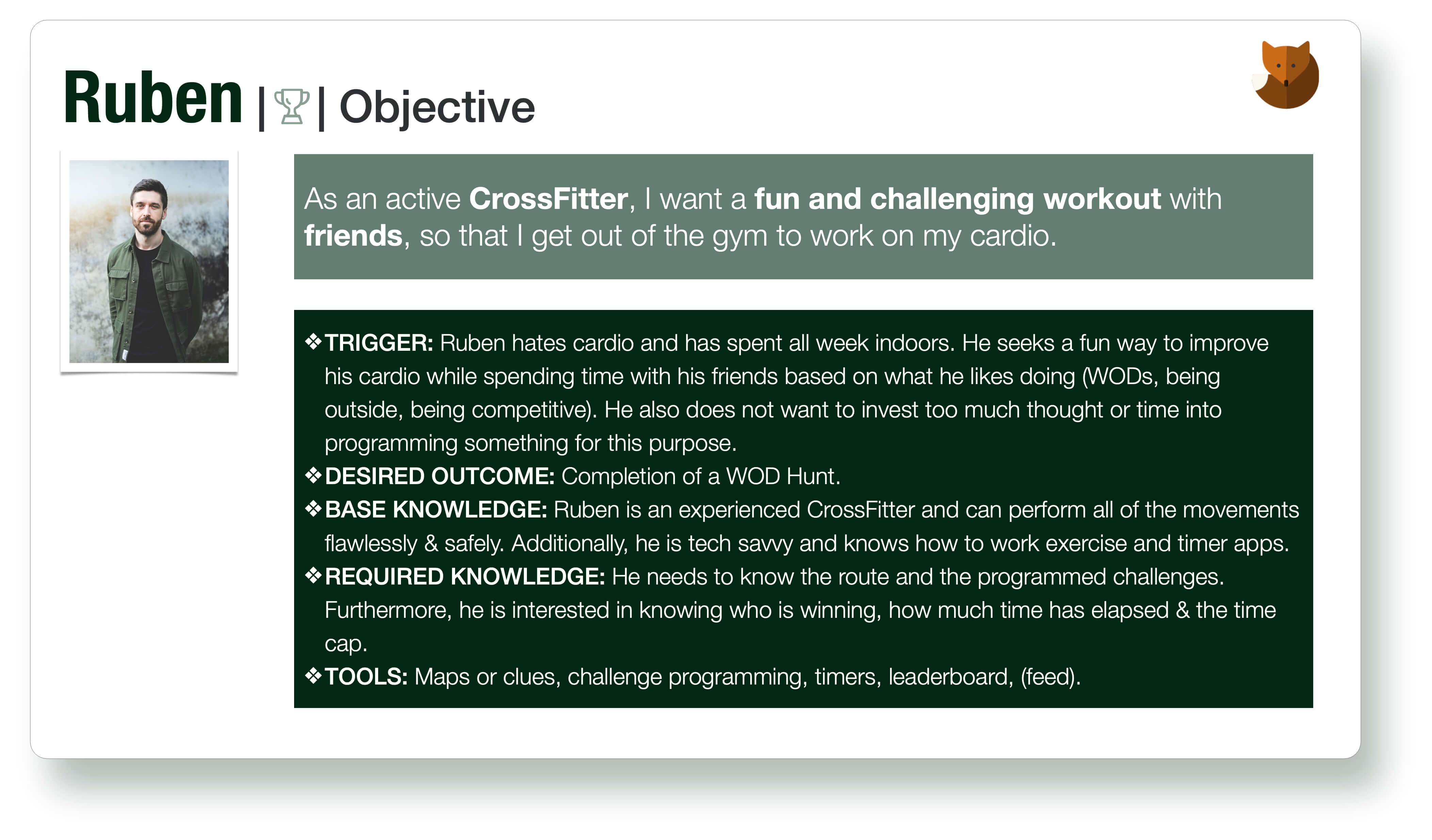
You have already met Ruben, the primary persona for this project, but how did I arrive at his creation?
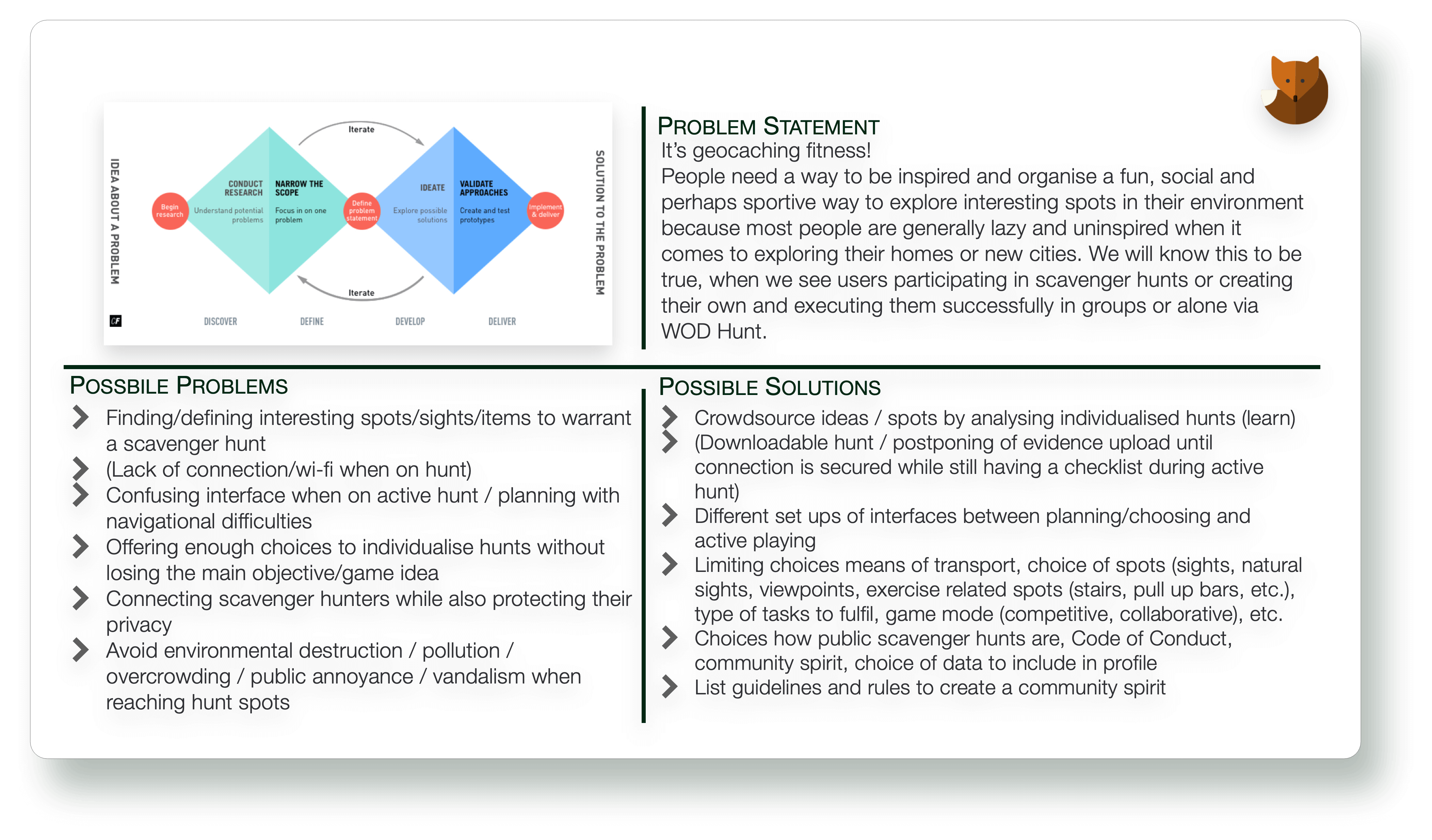
My first step in this project was to dive deeply into the problem in order to understand it completely and get to its core. Only with this empathy for needs and motivations would I be able to find viable solutions to real problems.
So, what is the problem to the solution that I want to provide?
Fitness enthusiasts, especially CrossFitters, usually thrive on strength-related exercises and workouts but avoid anything cardio. There is a whole culture within CrossFit that revolves around mocking cardio and hating burpees, the assault bike and running.
Thus, the problem seems to be: How can we make endurance training more fun? Based on these assumptions, the goal with WOD Hunt will be to provide an app that uses elements of gamification to utilize CrossFitters' inherent playfulness and love for competition to make endurance workouts more fun and social.
I.2 Competition
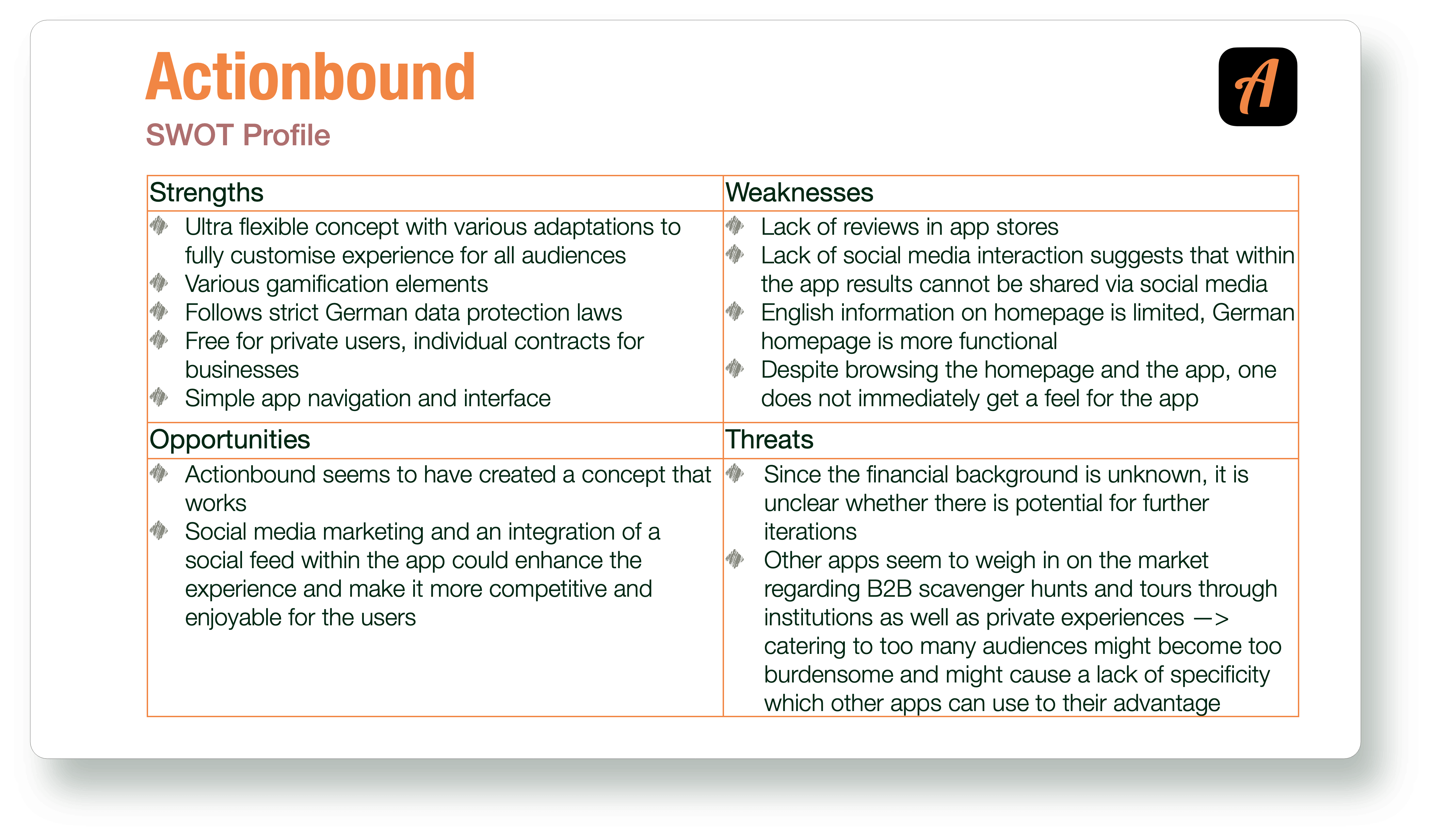
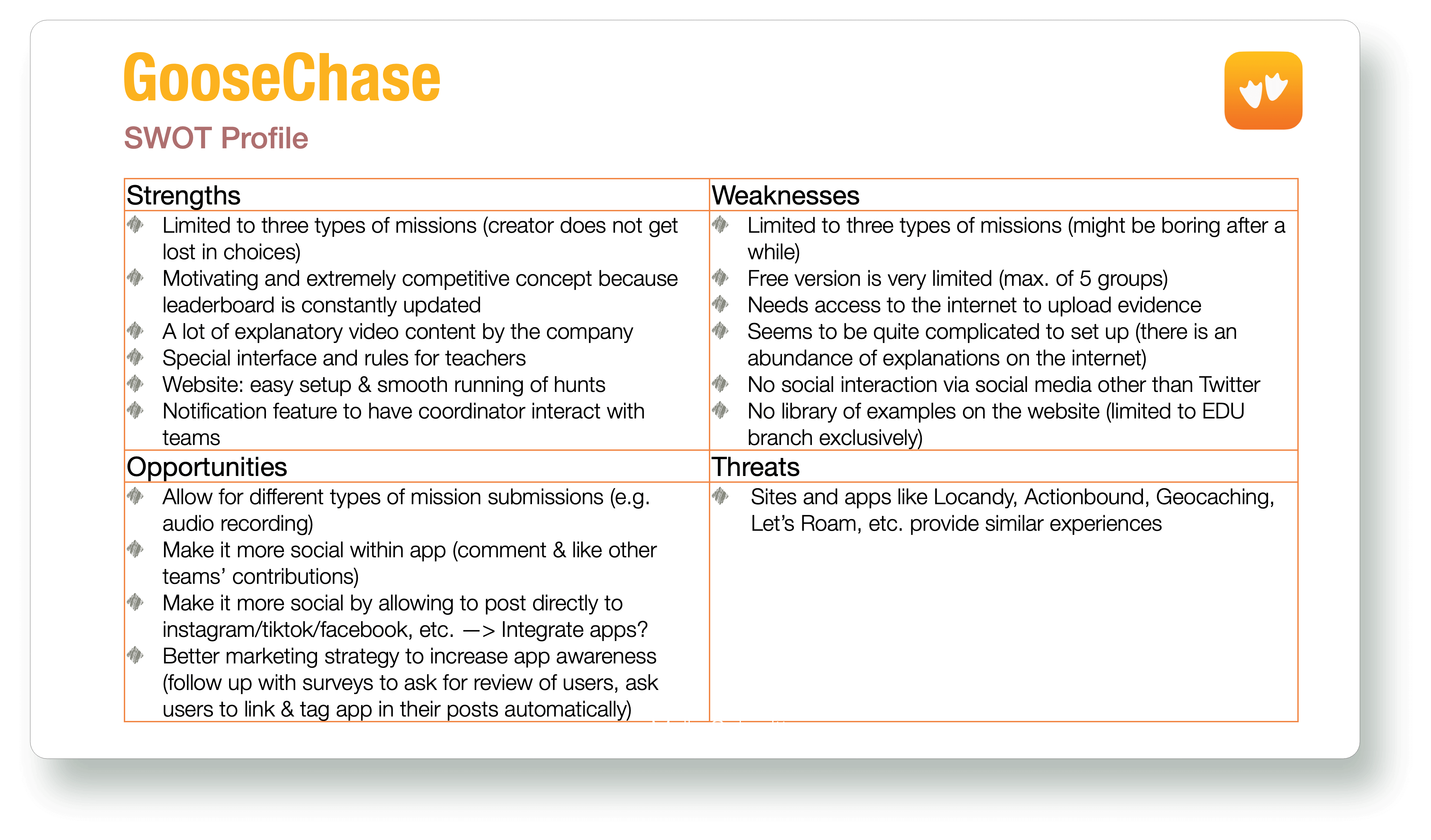
With this vision in mind, the project moved on to competitive analysis. After a thorough investigation into possible competitors, I looked more closely at the local German app Actionbound and the English-language equivalent GooseChase.
Actionbound 's motto is "let the tour begin" whereas their tagline explains how to do just that: "Create your own interactive guide." This app which has started out as an educational project in 2012 seems to stand out because of its flexibility as it can be used by businesses, educational institutions, or private people with great reviews.
Goosechase 's motto is "scavenger hunts for the masses" whereas their tagline boldly claims their tool to be '[t]he easiest way to organise and run a scavenger hunt.' They call themselves the "original" scavenger hunt app.
Both of these examples focus on the game of scavenger hunting as the main focus, the type of tasks teams have to complete just varies across their different target audiences, however, none of them or the competitors seems to apply the game's principles to fitness and workouts. This seems to be a viable niche for WOD Hunt.
On the other hand, I also completed some analogous competitive research into outdoor fitness apps that remotely do what WOD Hunt needs to be able to do: GPS-track progress of the athlete. Here Strava seemed to be the most interesting and closest to what WOD Hunt 's vision included. Due to Strava 's inclusion of different movements (i.e. running, cycling, hiking), I was inspired to consider a choice of cardio elements for this project as well.
I.3 User Research
Next, it was time to find out more about potential beneficiaries of this project. In order to conduct some user research, I defined the following research goals:
- To better understand user behaviour around scavenger hunts and outdoor exercise;
- To determine which tasks users would like to complete using an outdoor exercise scavenger hunt app;
- To figure out user pain points with existing outdoor exercise or scavenger hunt apps;
- Collecting data on the context in which users would use an outdoor exercise scavenger hunt app.
Interesting findings from the survey included:
- Most people have done a scavenger hunt before, but not regularly;
- More than half of the participants rarely train with others outside;
- 19 out of 27 participants use apps for their exercise;
- Walking & jogging are the most common movement (85.1%);
- 4 out of 5 participants: Friends make exercising more enjoyable;
- 88.9% think that games make exercise outdoors more enjoyable.
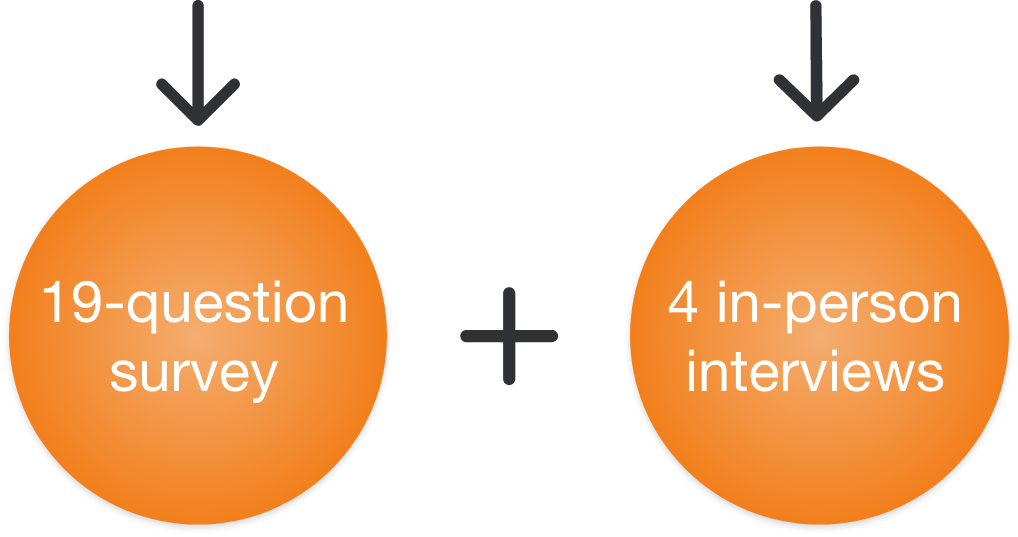
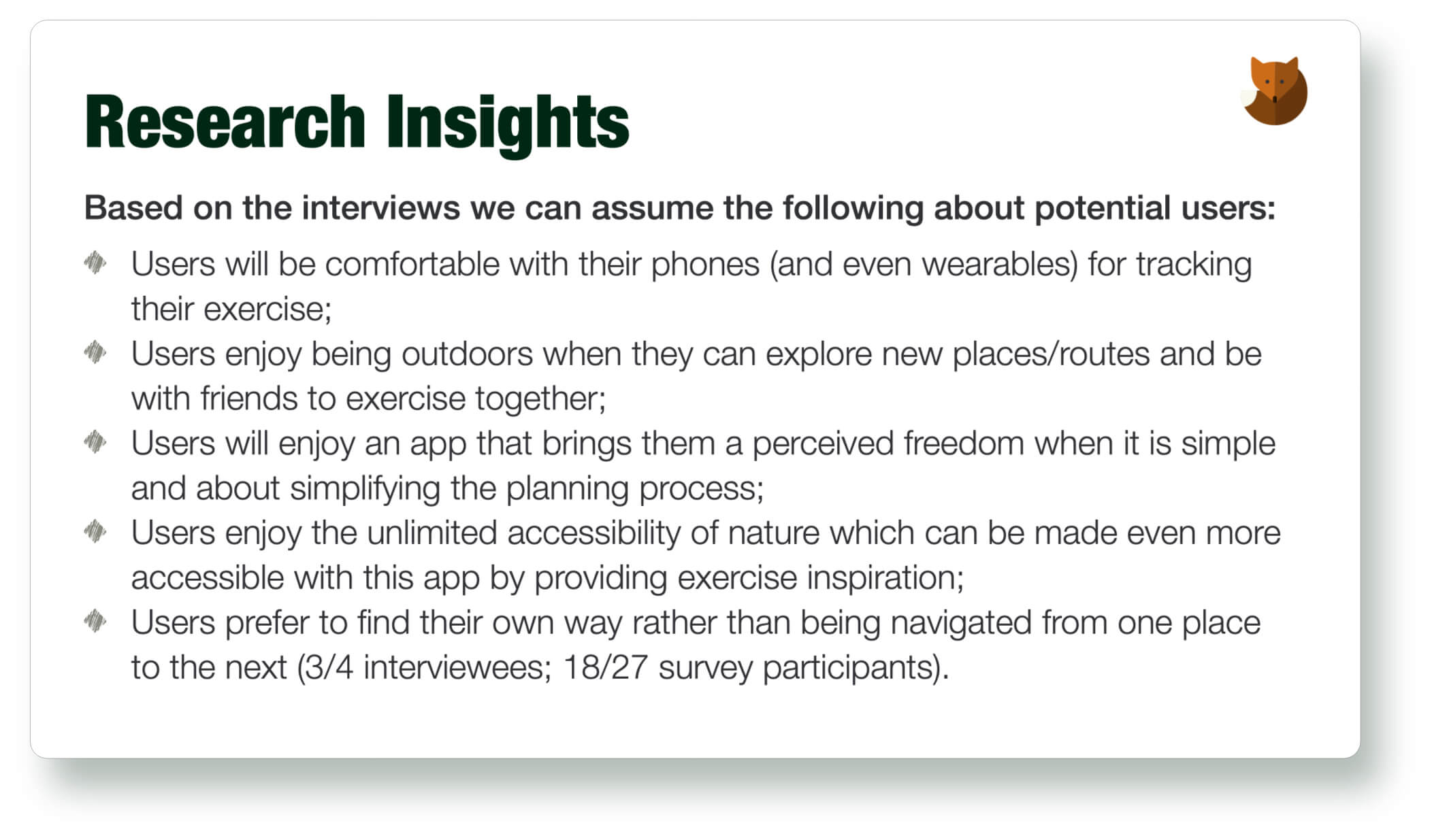
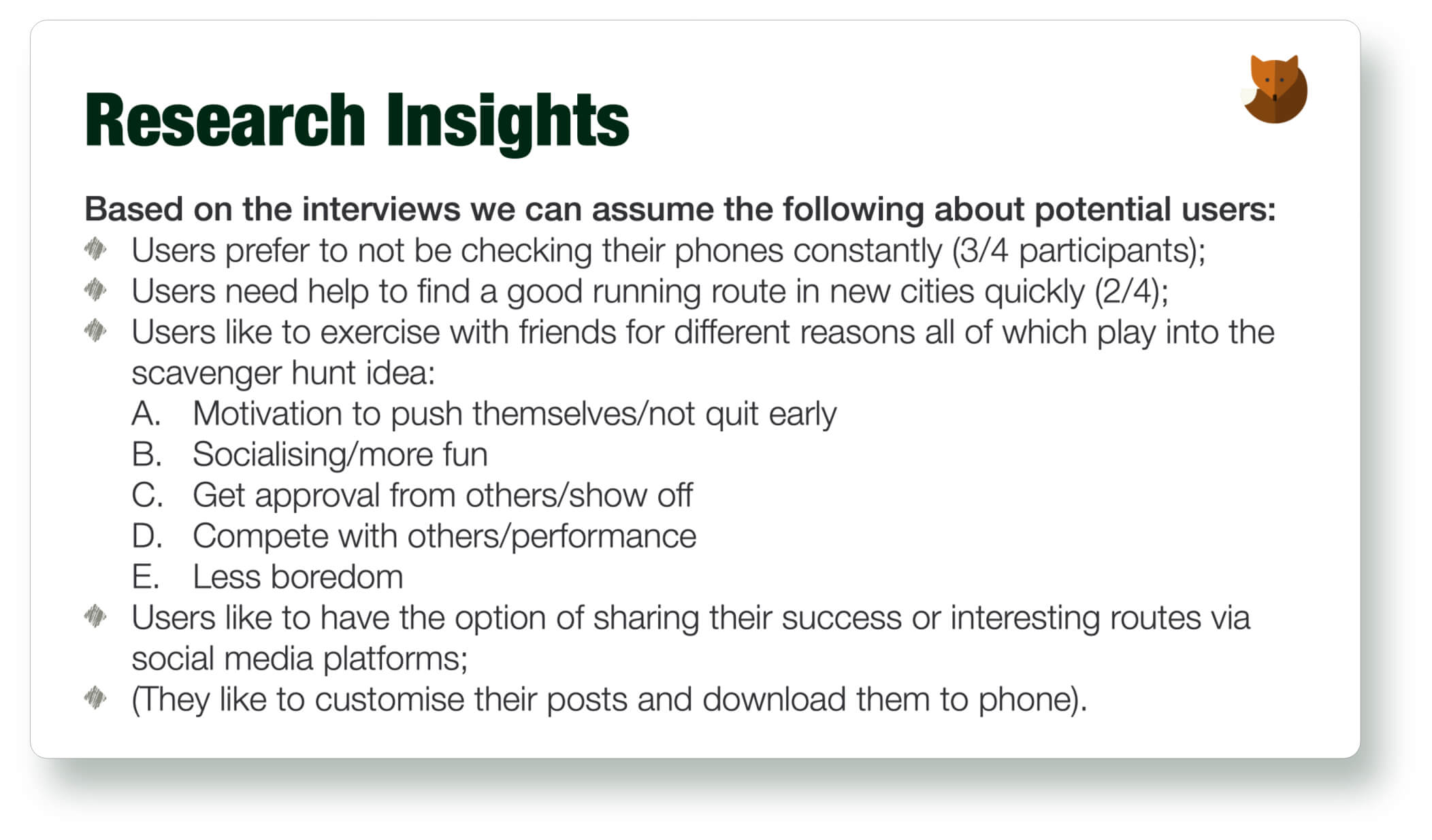
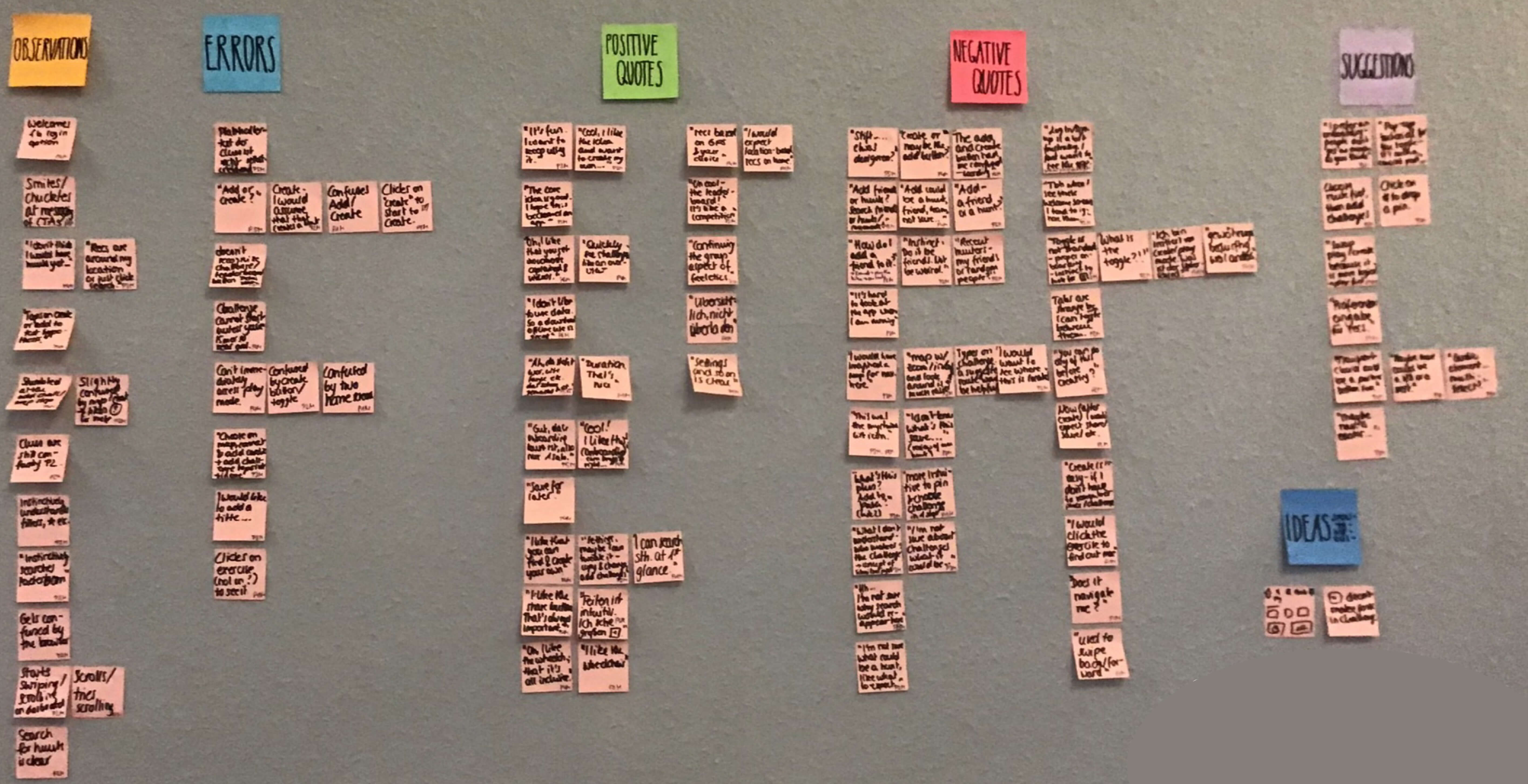
In the meantime, I held four personal interviews which lasted between 18 and 26 minutes that provided me with some in-depth insights and learnings to then aggregate and sort these via an affinity map.
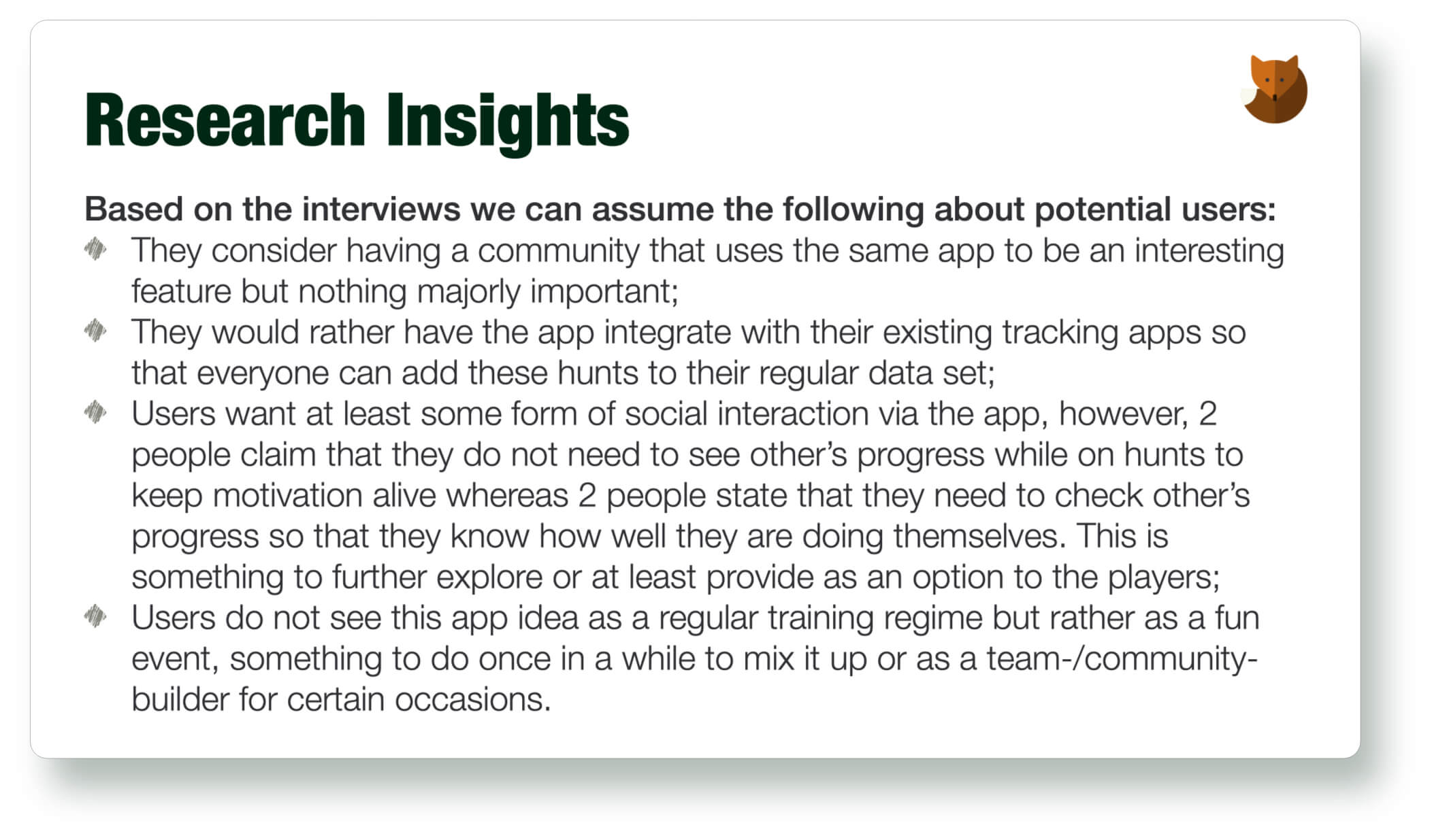
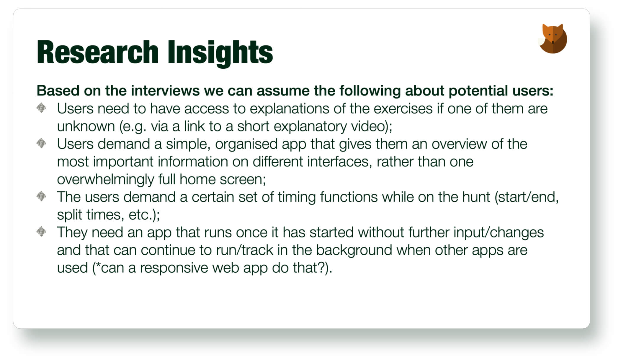
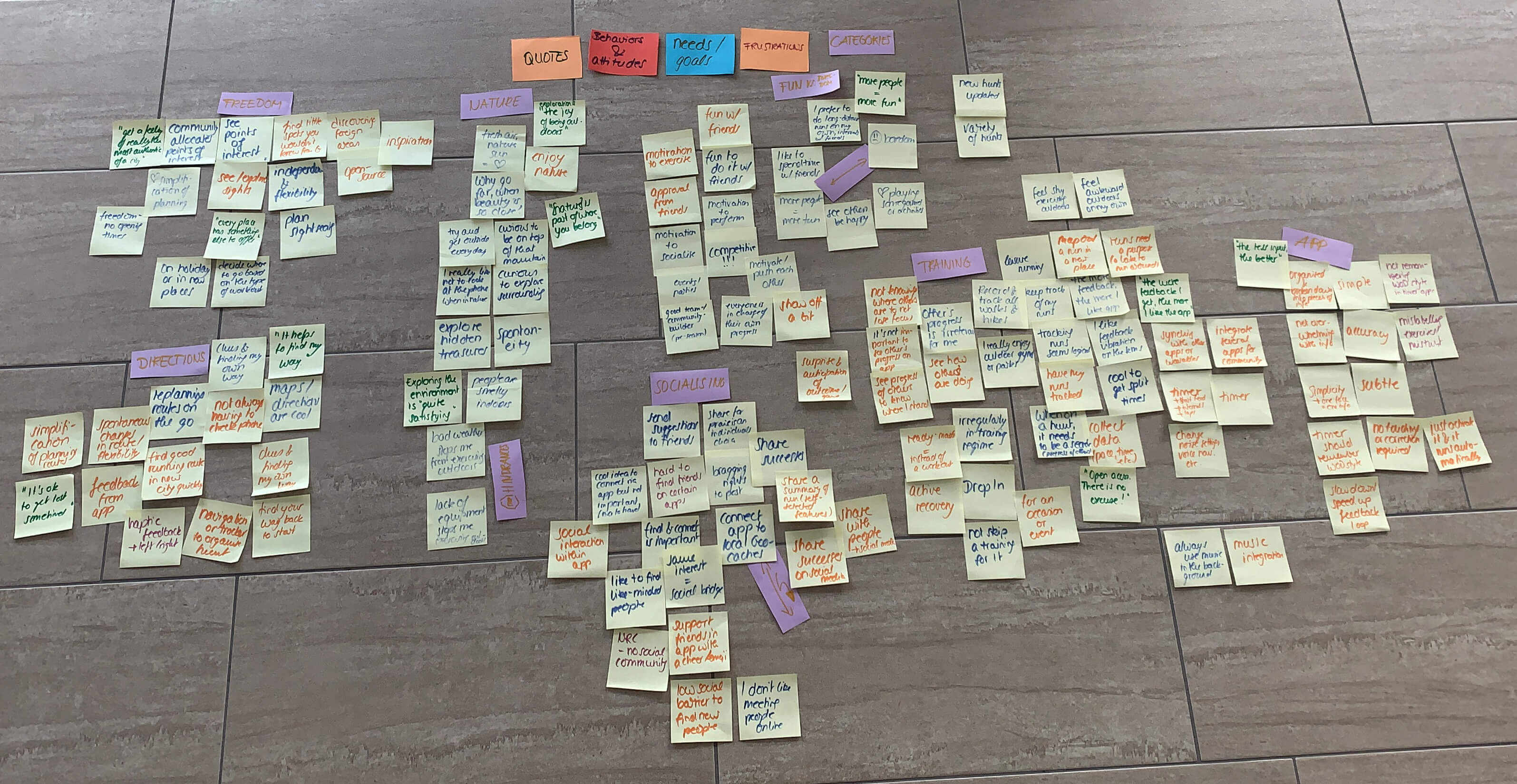
The affinity map aggregates the findings, such as quotes, behaviours, attitudes, needs and goals as well as frustrations from the interviews in different categories (purple).
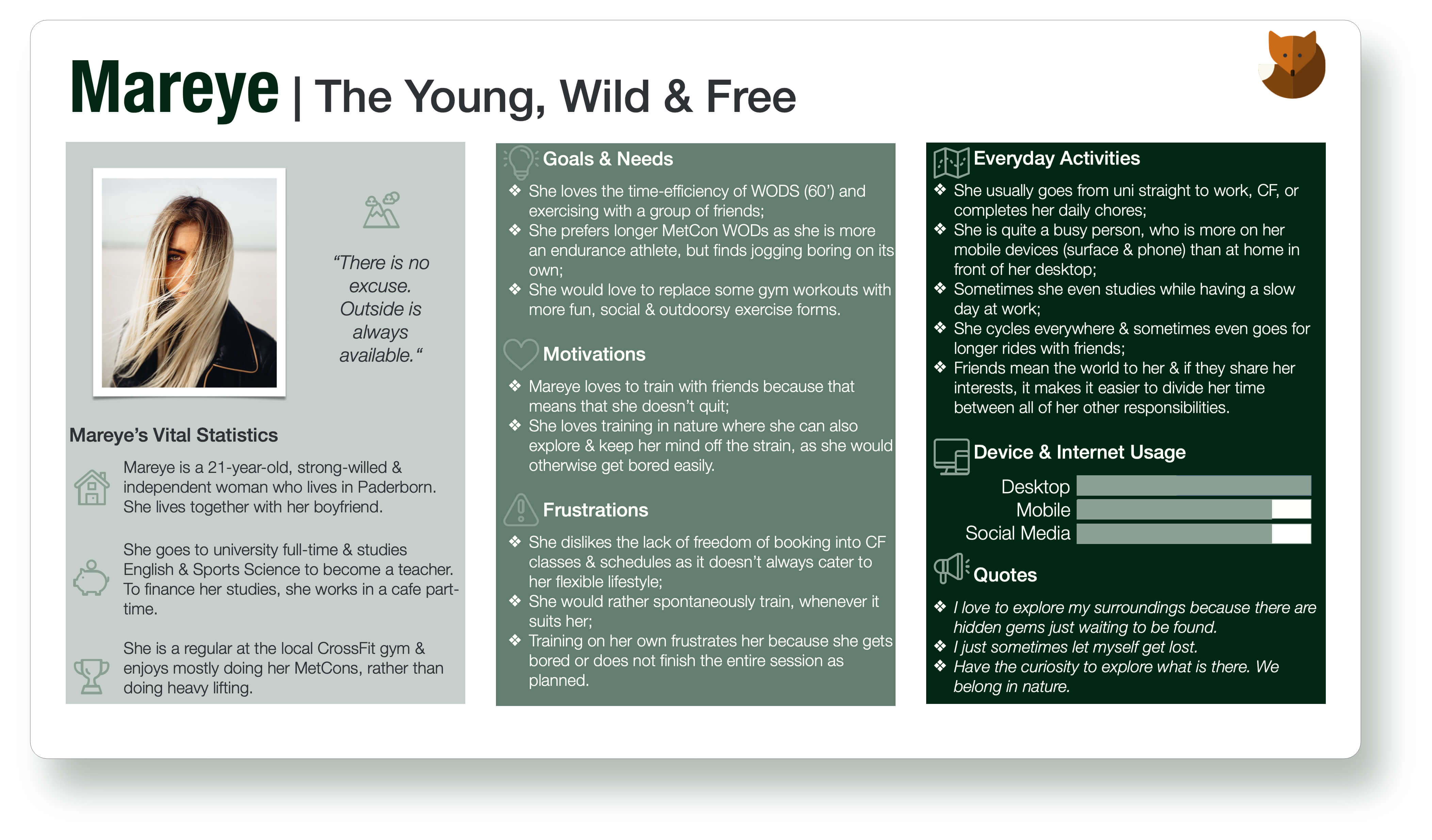
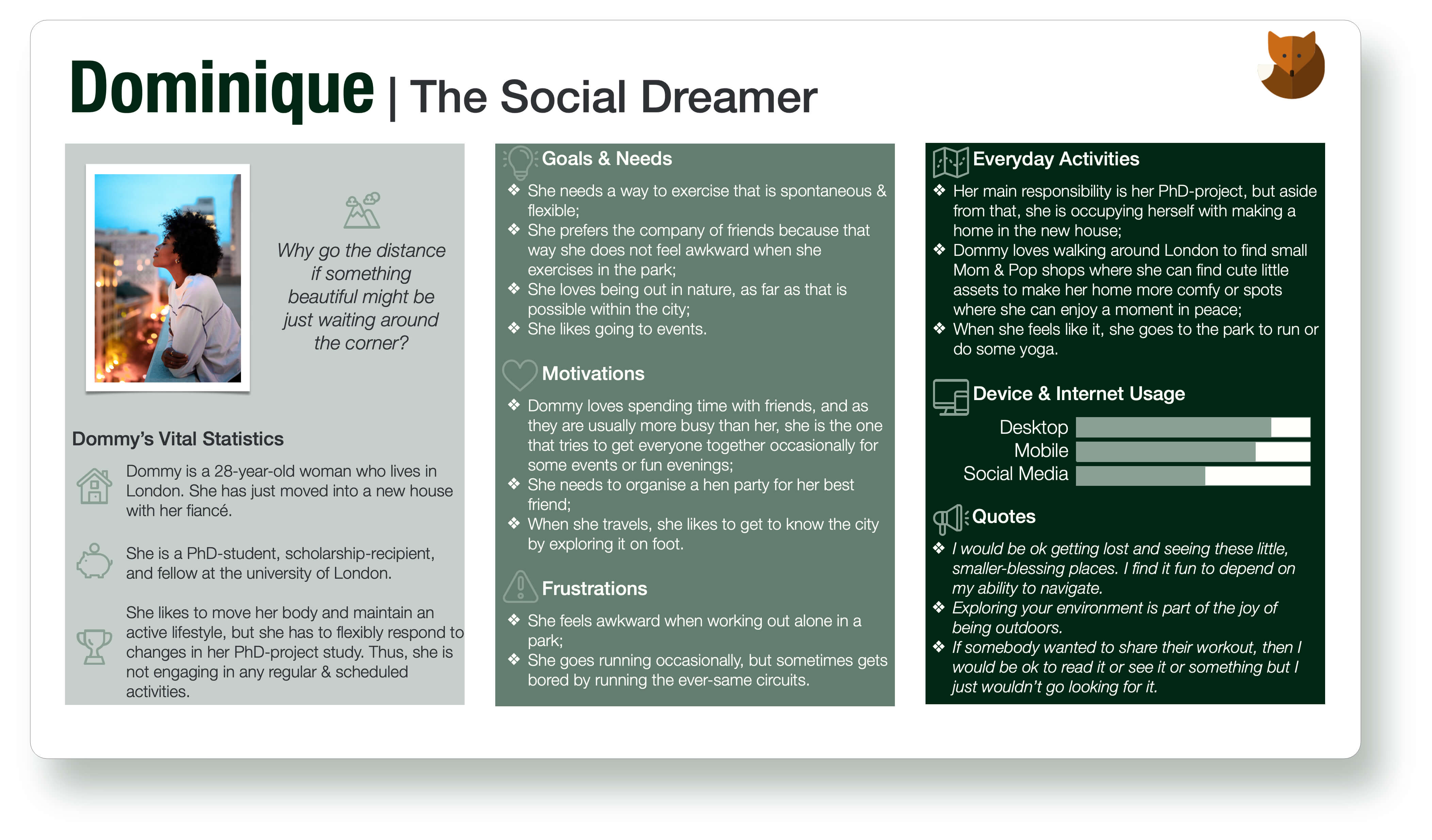
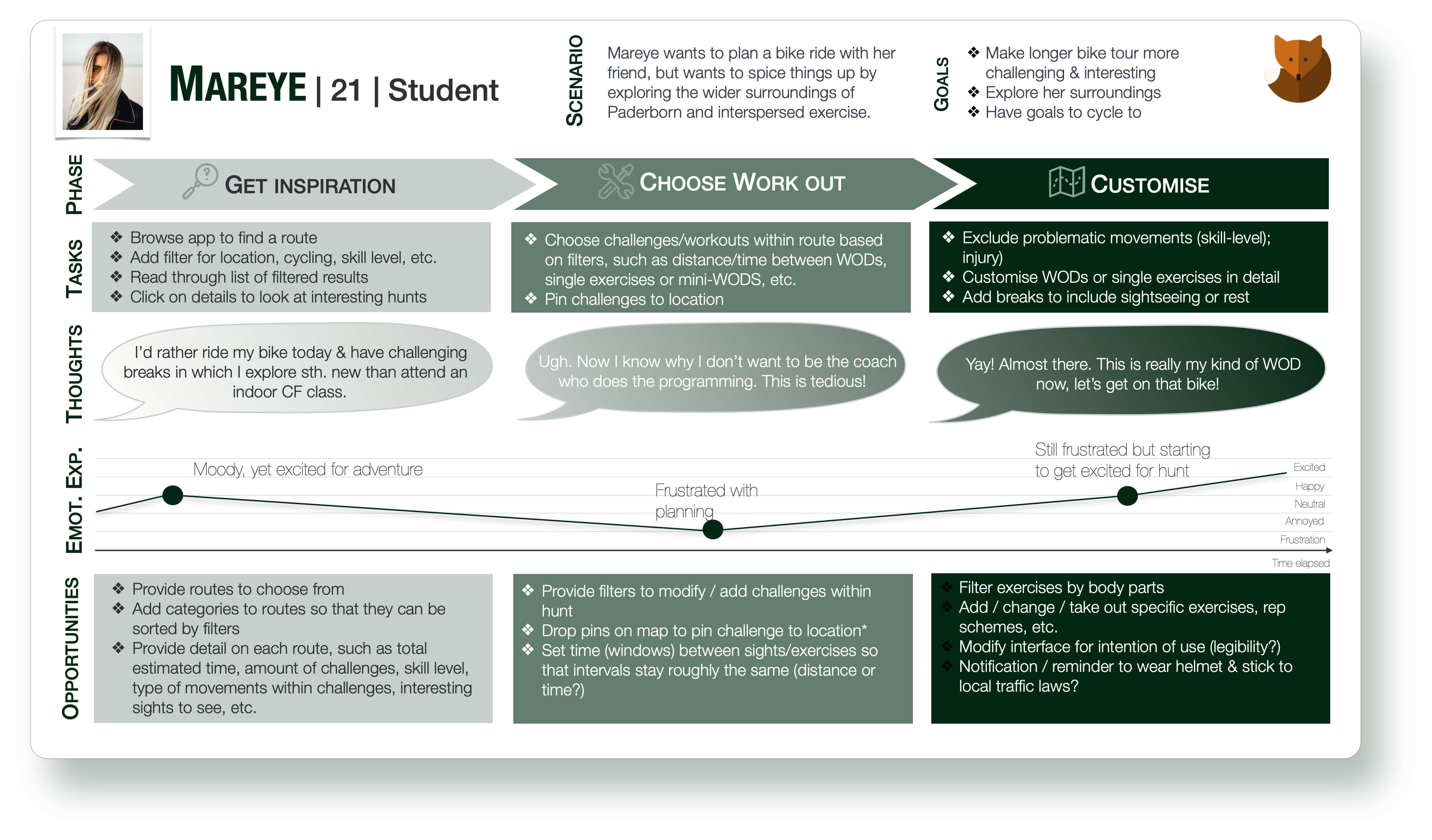
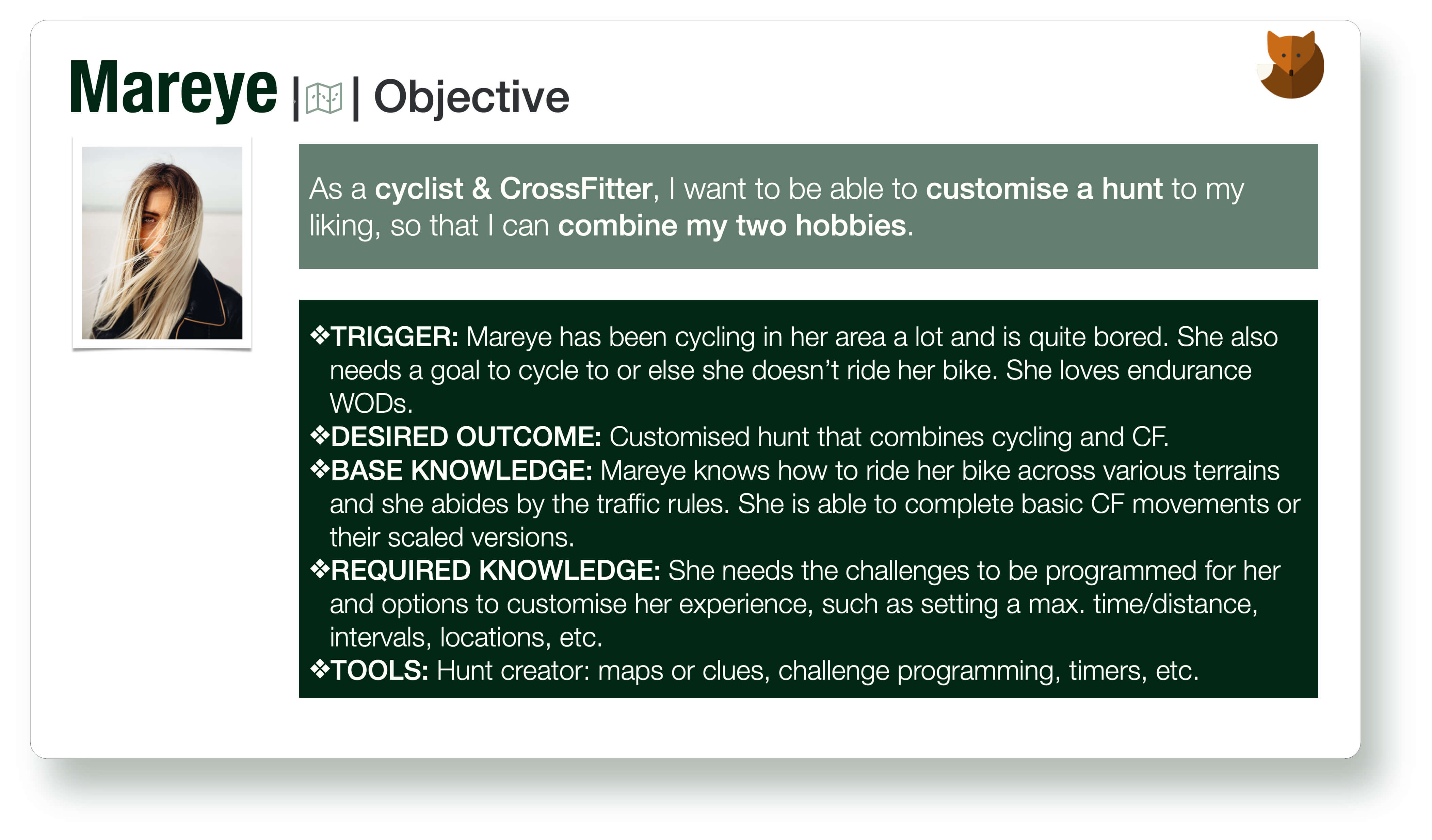
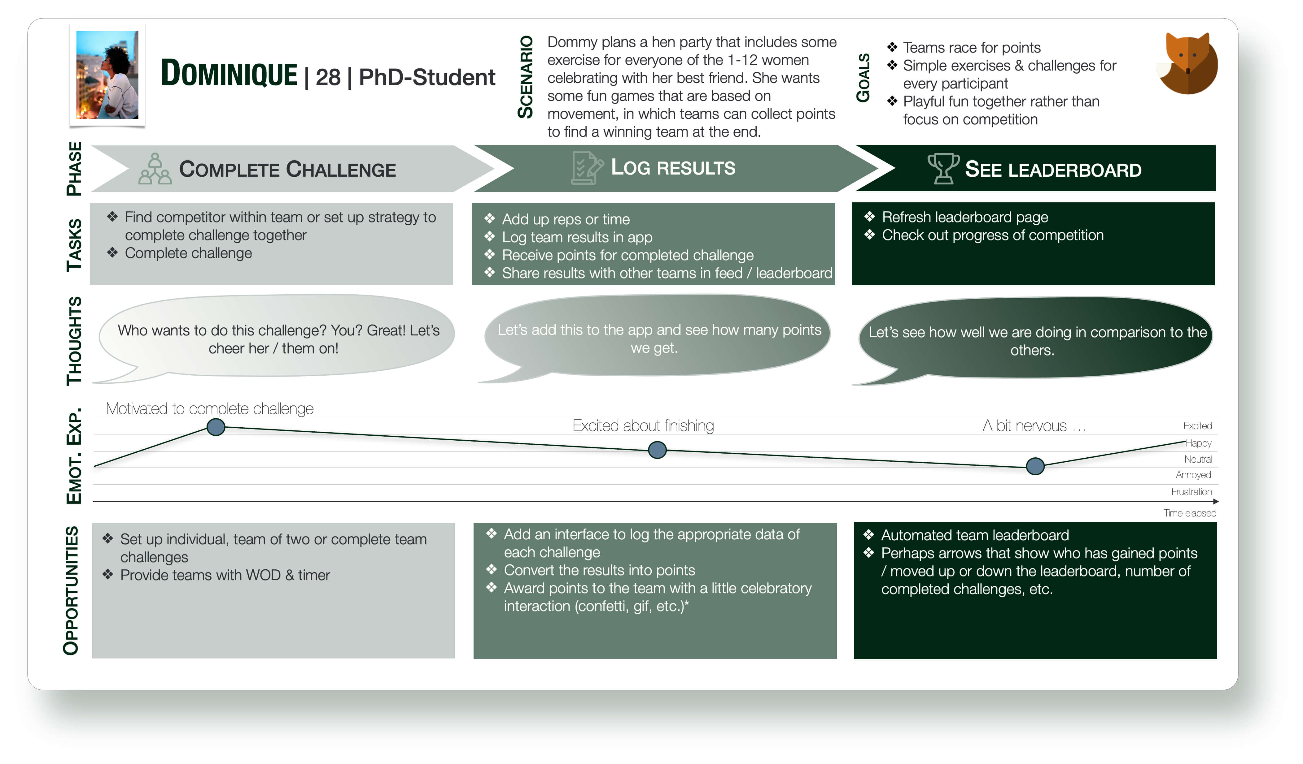
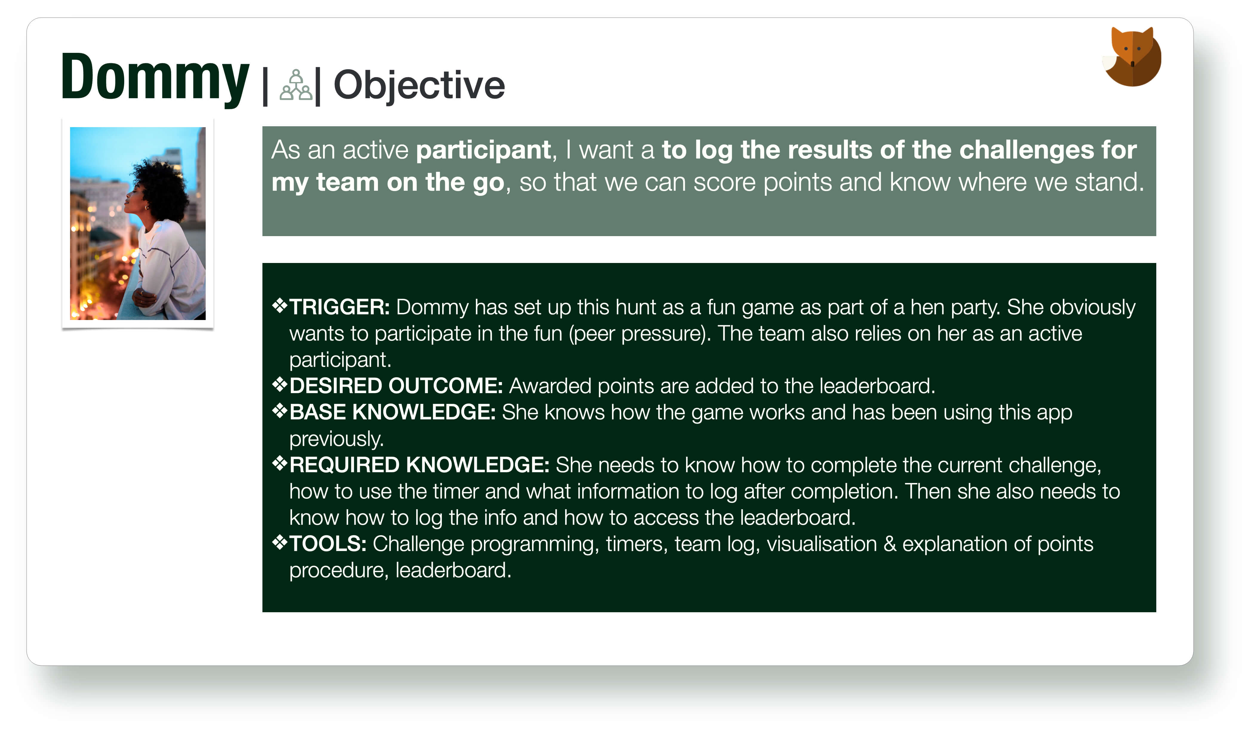
I.4 User Personas
All of this aggregation and analysis of data finally culminated in my three main personas, one of whom you have already met. Personas help to personalise and break apart the diagnosed problem by highlighting goals & needs, motivations, and frustrations of potential users. This helps to design specific solutions based on these smaller pieces of the puzzle.
II Define
II.1 User Journeys
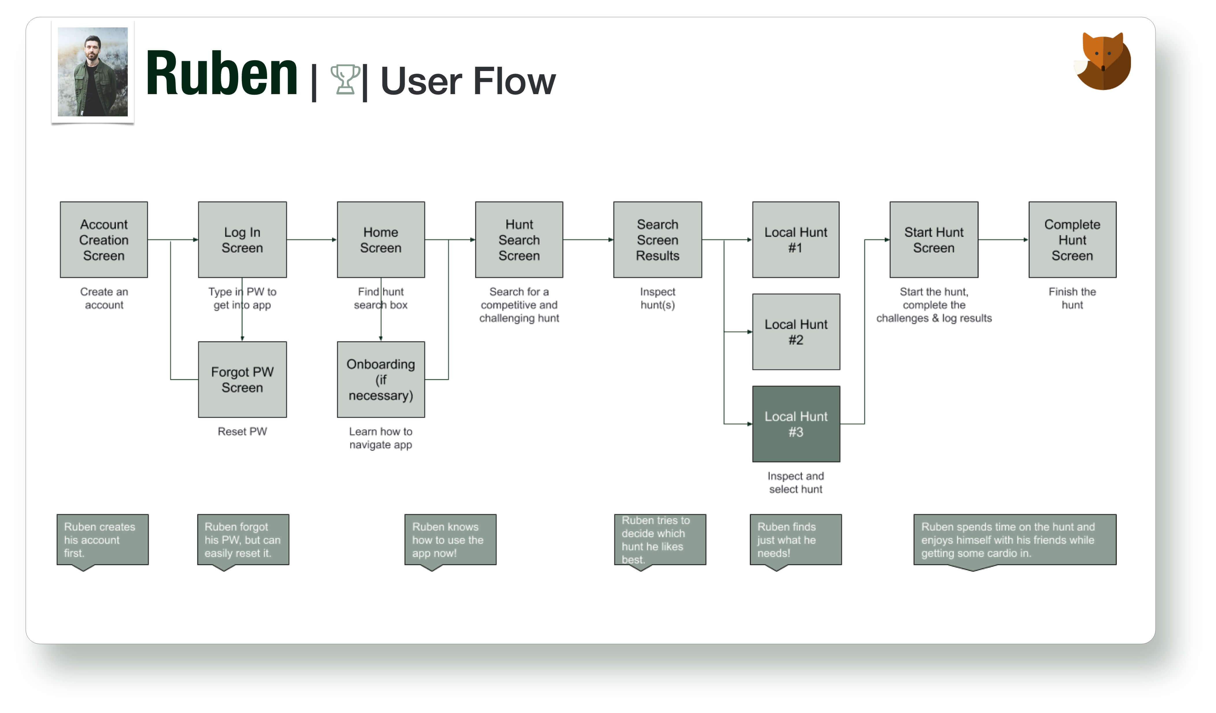
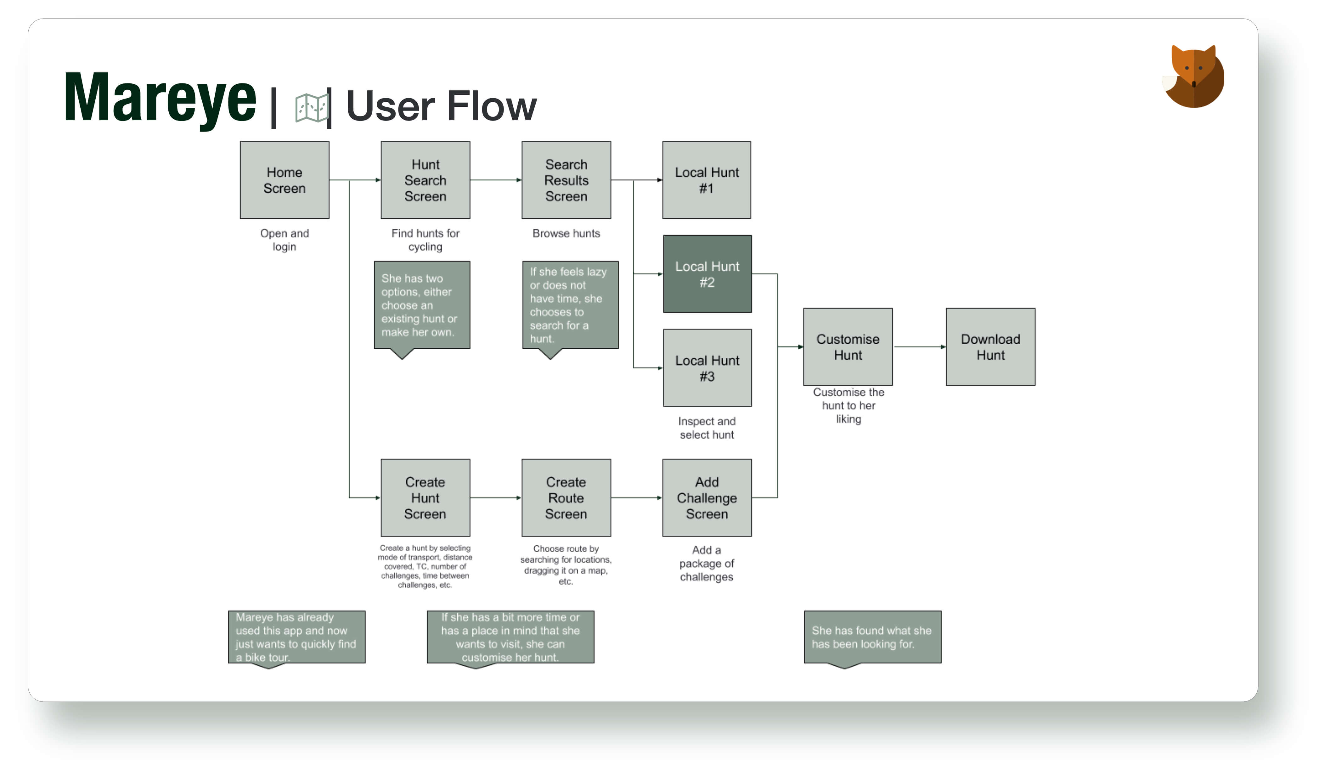
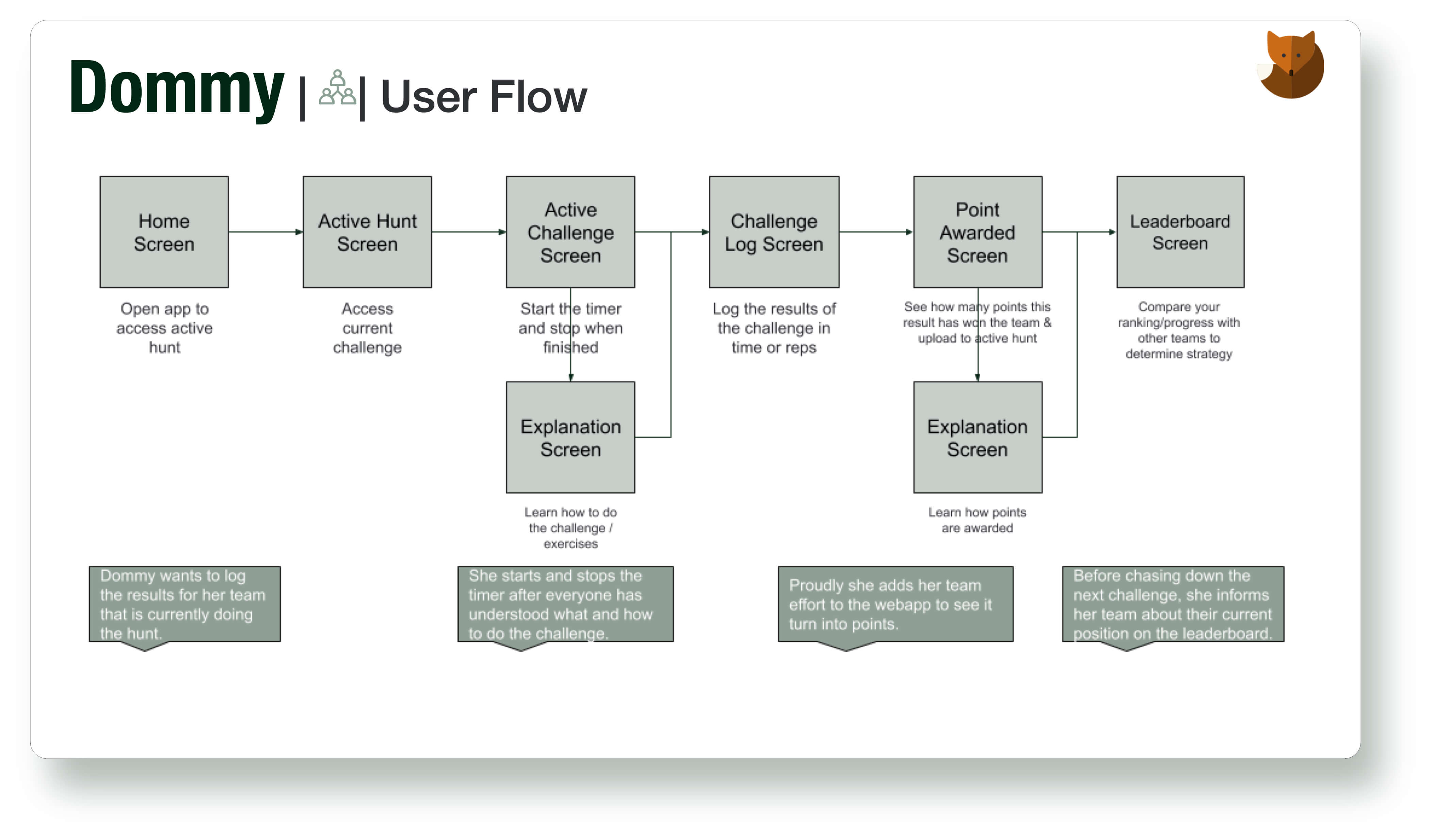
Based on the personas, the ideation process of WOD Hunt could finally start. The next step uses the personas created and creates each persona's journey through the app, culminating in user flows.
II.2 User Flows
By now, it became high time to find solutions. To accomplish this, a flow was created for each persona aiming to fulfil their main needs and objectives.
These flows visualise the separate screens needed in order to complete a persona's task. For each main task, an entry point and success criteria were defined.
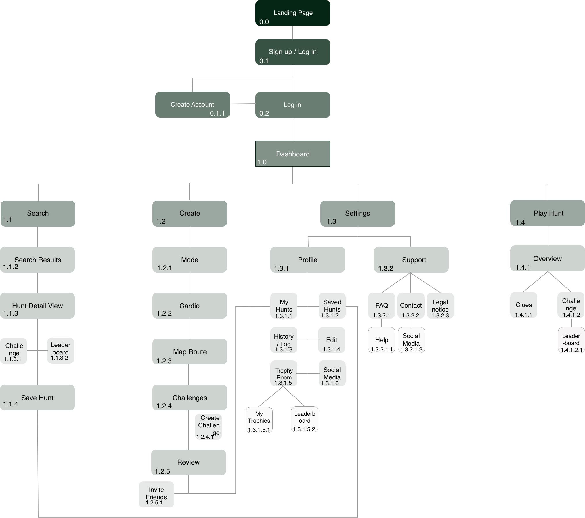
II.3 Sitemap
Subsequently, based on the individual flows and the planned elements of the app, the information architecture was created and visualised in the form of a sitemap.
The initial sitemap went through several iterations based on user testing via card sorts and also further developments during the prototyping phase.
III Ideate
III Wireframes
By now I had a structure of the app but no visualization, so I took pen and paper (both analogously and digitally on the iPad) and got to work on the initial low-fidelity wireframes. This helped to get the ideas from my head and lay them out next to each other, making it easy to change and iterate as the process went on. As soon as the first flows for the personas were completed, the fidelity was increased by creating these wireframes with software such as Balsamiq and later on Adobe XD.
The continual refinement of the wireframes across multiple iterations has helped to fine tune the flows and edge out usability issues. Especially the navigation was a challenge and has undergone the most changes.
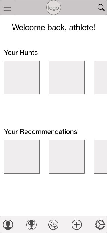
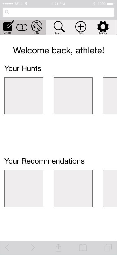
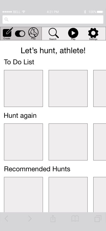
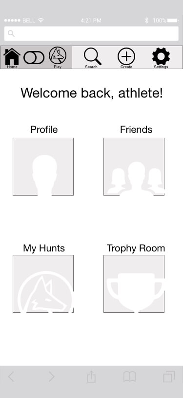
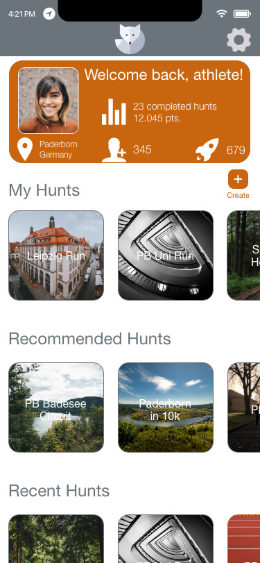
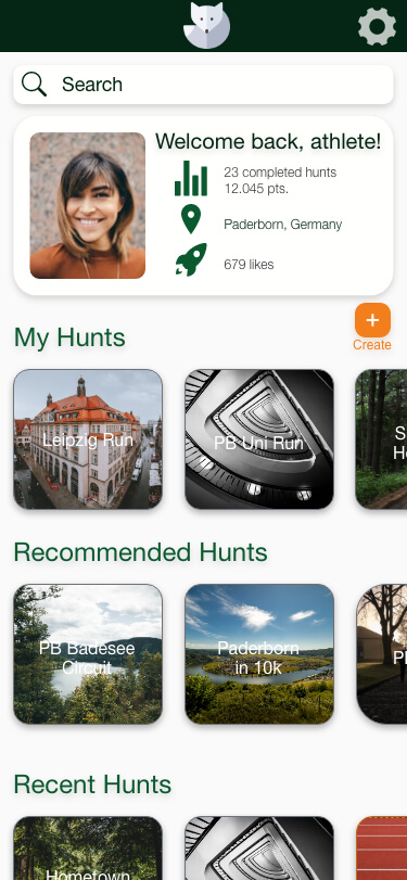
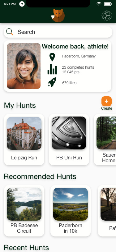
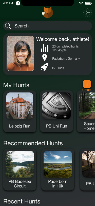
The following examples show the iterative design process and the changes WOD Hunt has undergone. The navigation was re-designed from a dropdown menu structure via a toggle option to have two parallel dashboard variations to a single no menu dashboard screen from which all actions can be completed.
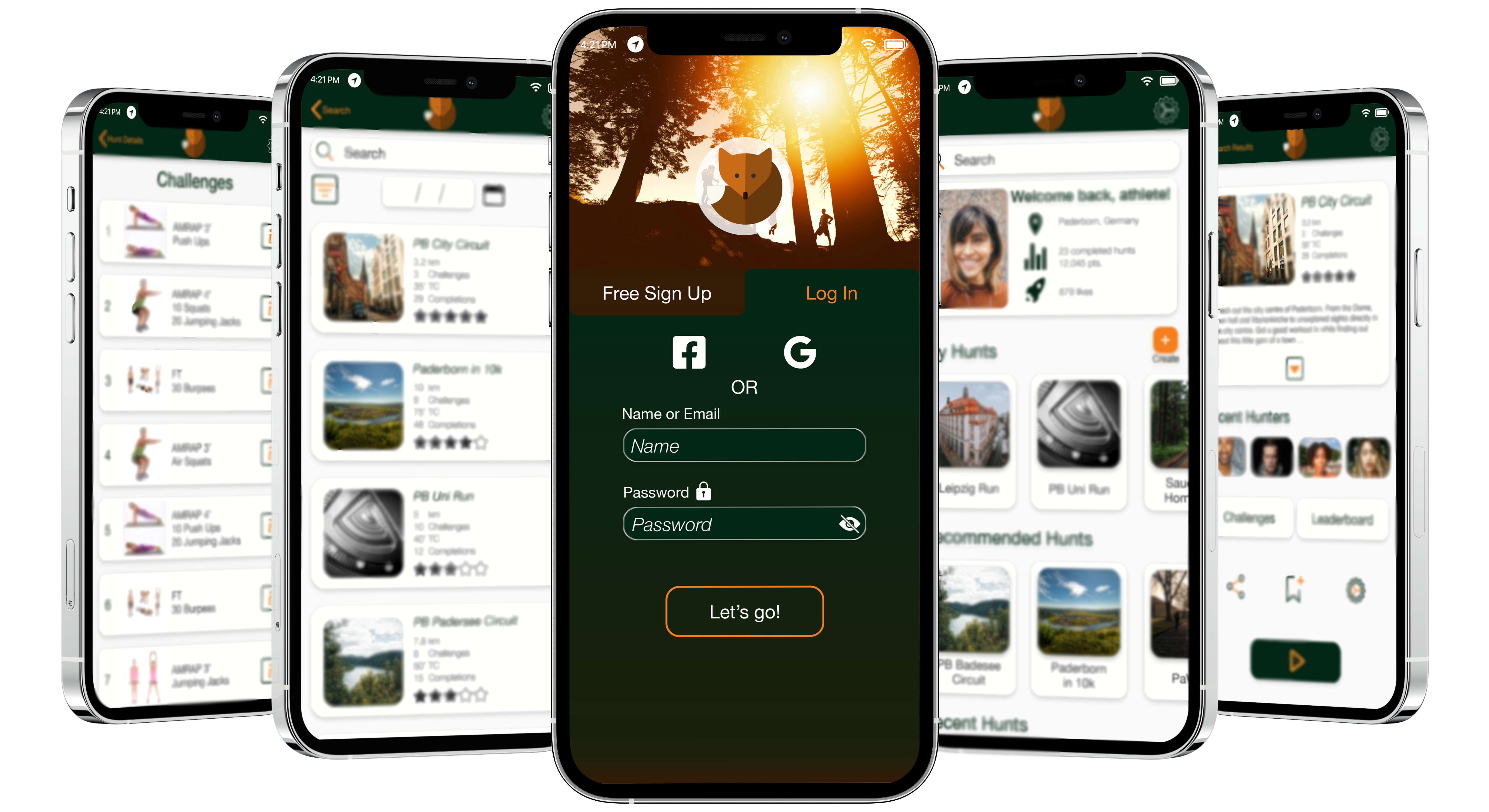
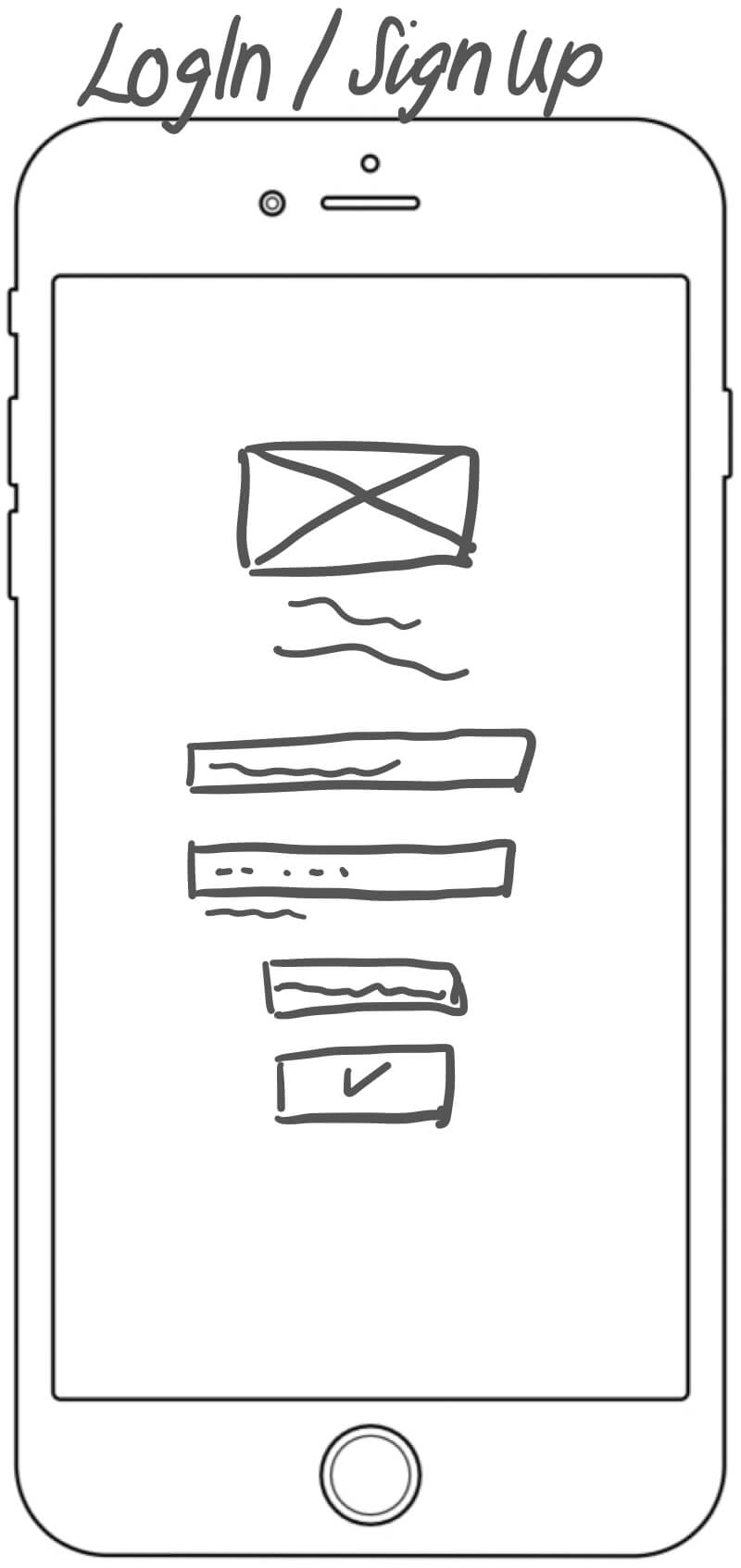
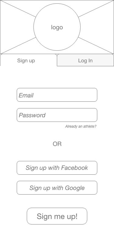
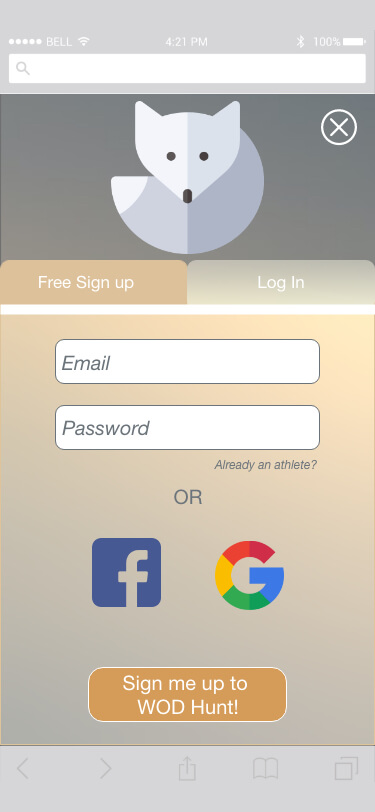
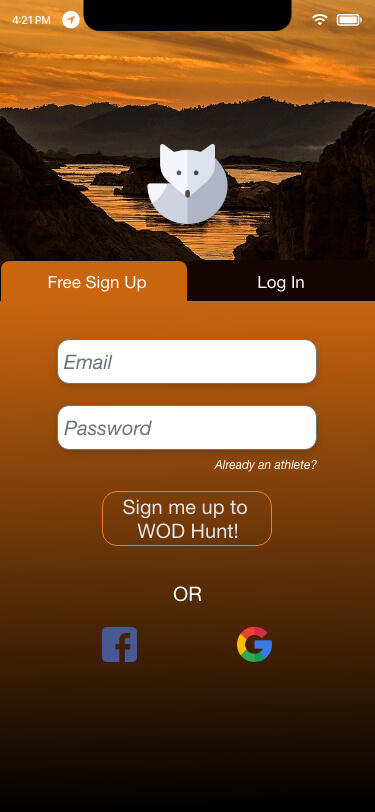
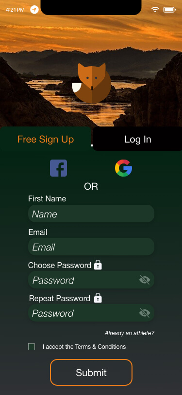
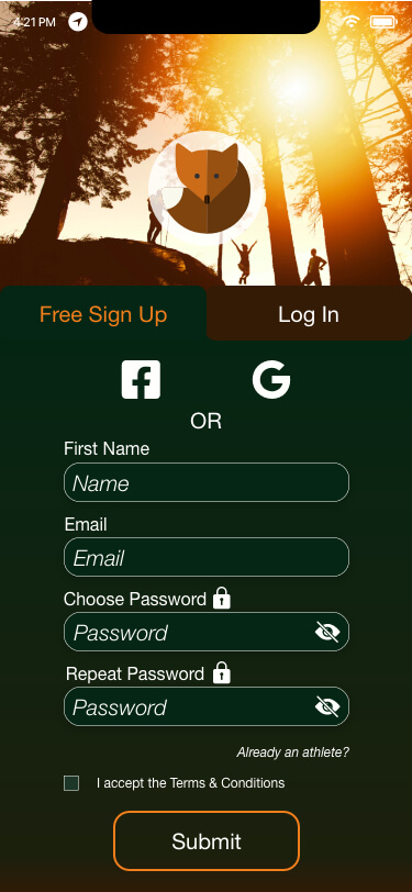
Evolution of the Sign up / Login Flow
Evolution of the Navigation


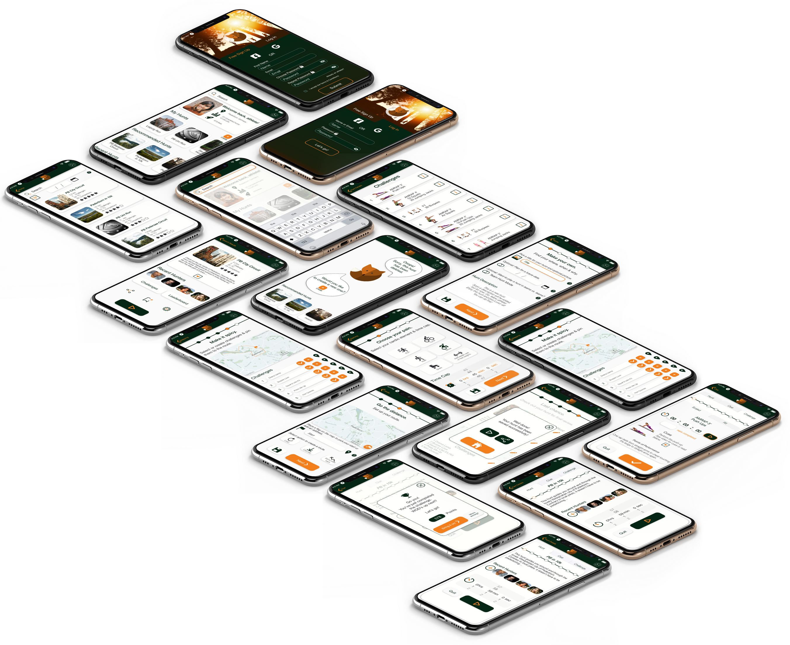
IV Prototype
IV.1 Mobile First
As soon as I had completed the first version of high-fidelity wireframes, I used Adobe XD to tie the screens together and create a clickable prototype that could also be tested.
IV.2 Desktop Wireframes
Simultaneously, while a mobile app is the project's priority, I continued to compile further iterations on the desktop variant.
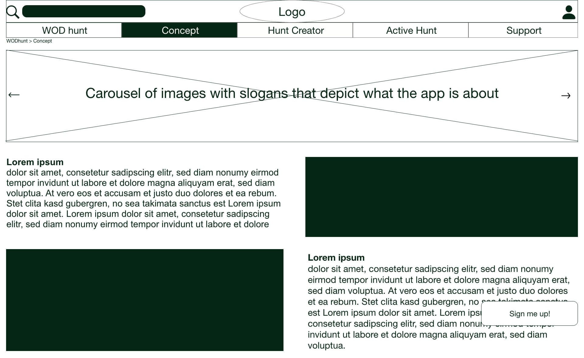
Desktop: Concept
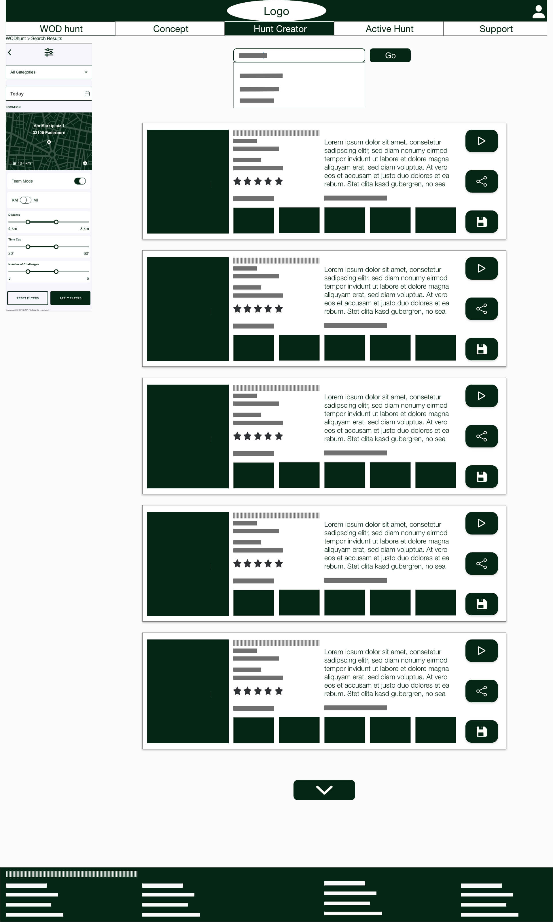
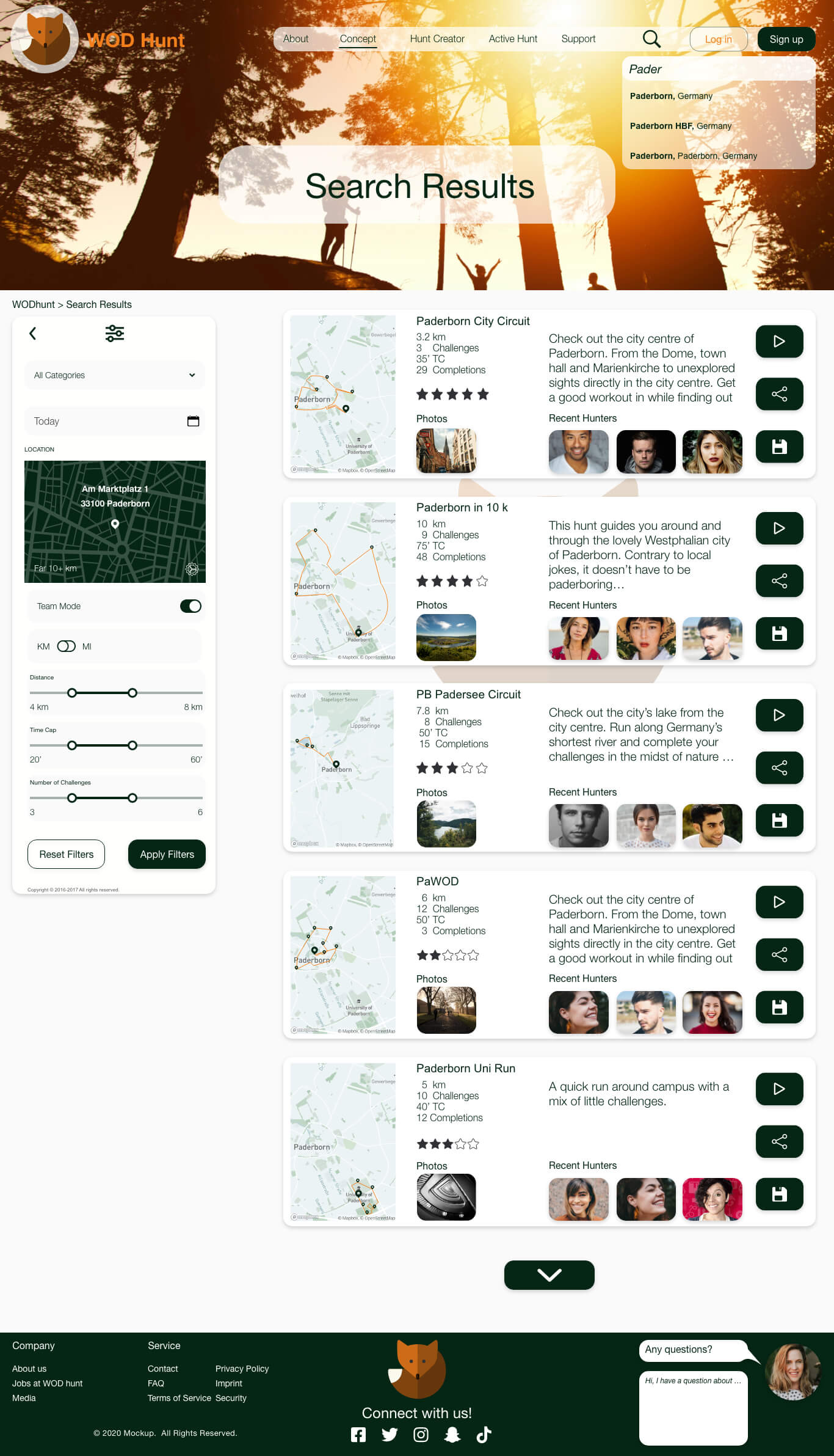
Desktop: Search Results
V Test
V.1 Usability Testing
In order to start the testing process, a usability test plan and script were compiled. Since this was the first round of usability tests, it was supposed to evaluate the learnability for new users interacting with the application for the first time on mobile.
The aim was to examine and measure if users understand the app's navigation, purpose, value, and how to complete basic initial functions such as logging in, searching for, creating or playing a hunt.
Main Objectives
- Determine understanding of the app's purpose & value
- Observe navigation & successful completion of tasks
Methodology
- Moderated in-person test
- 6 participants
- 10-15 minute interviews
- Recorded on video and with screen recording
Findings
In order to structure the analysis and sort the findings into useful observations, several methods such as creating a rainbow spreadsheet or concept mapping were used as highlighted below.
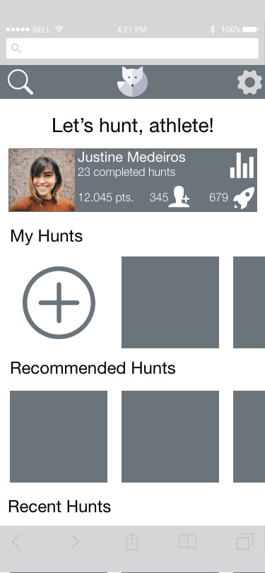
At this point in the design process, the app featured the toggle navigation with two parallel dashboards that divided the app into a create mode and a play mode.
It was the main intention of this test to observe whether participants could understand and use this navigation logic.
Main Issue: Navigation
Out of the six participants in the usability test, all could successfully search for and create a hunt. However, only two out of six could complete the task of starting to play a hunt on their own, which involved a switch in dashboards via the navigation toggle.
The other four needed a hint to succeed. The participants found this type of navigation novel and not intuitive.
Other issues involved the clarity of icons and redundance of help buttons as well as a simplification of the hunt creation flow.
V.2 Polishing the Design
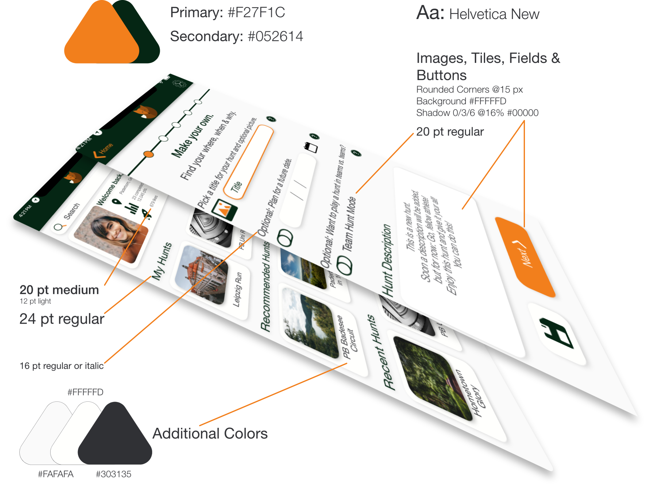
As soon as the kinks in the usability of the main flows were straightened out, I began to figure out the UI of WOD Hunt. For this process, I needed to choose the colours, shapes and mock up central components.
By taking the Gestalt laws as well as emotional and visual principles of design into account, the app's UI was updated and improved in several iterations.
V.3 Evolution of Style
Since WOD Hunt is relying loosely on the ideas of CrossFit, will be done outdoors and is about hunting, the fox logo came to mind immediately.
Based off this idea, the pine green color was chosen as its main color. CrossFit is usually about dark color themes and the idea of hunting and foxes reminded me of the woods. Green is also a calming and respectful color while the orange is exciting, energetic and matches the idea of the app. As I wanted a professional yet engaging app that also does not lead to cognitive overload, an off-white and off-black were chosen as the main background colors.
As soon as the ideas for the final mock ups and UI existed, the information was gathered systemically in a style guide in both a pdf and via Zeplin and further comprised in the visual design system.
Conclusion
Thanks for reading till the very end. I have just a few words left and they are about the outlook of the project about ideas further down the road.
WOD Hunt will need to comprise more than the three basic user flows I have laid out here. There will be further aspects and flows to be added such as a chat function, a check out to purchase hunts or a friend finder. Additionally, users will want to add and or change their profiles and link their social media channels. All of these features might still be added to the project. For now, as a part of the scope of my course, this project is finished.
Here you could witness my first steps as a UX designer. I have poured my heart and soul into this project. WOD Hunt was born from the project trief of creating a scavenger hunt app, but it became an app that feels so needed at this point in time. Lockdown has us all lacking social contacts, and being a CrossFitter myself, I am yearning to be able to compete with others again. For anyone wanting to explore their surroundings and increase their fitness, this app can be an integral part of their training routine.
Additionally, I have poured as much heart and soul into learning as much about the UX and common softwares as possible, soaking up any piece of knowledge I could gather. I will strive to continue in this endeavour, enjoying the process of becoming a better version of me as a designer one day at a time.
Challenges
The biggest challenges for me facing this project were about keeping it as simple as possible and also creating final mock ups in the way I envisioned them. This was mostly due to my explorative approach in using Adobe XD and Sketch, especially micro-animations were quite irksome at the beginning. Fortunately, with more time comes more practice and I notices soon that I was becoming more efficient with both softwares.
Choosing the looks of the final UI and especially the colors has cost me a very large amount of time. This created a few challenges with tasks like compiling the style guide and visual design language. I think approaching this a bit differently, e.g. by using Zeplin from the get go, will help me a lot in the future.
Additionally, some of the interview results were a bit contradictory and thus it was hard to discern which way to go with this limited set of data. However, with a lot of conversations with both my mentor and tutor, I feel that I have created a MVP that satisfies the most common needs of athletes in the app's initial stages.
Successes
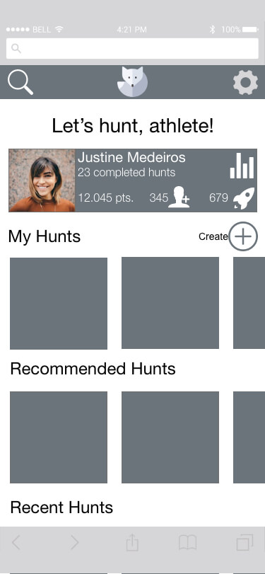
The success I remember the most can also be connected to one of my main learnings. This moment stands out because it was the culmination of such a long process. This moment was the final realisation that WOD Hunt didn't even need a menu to navigate through the app. By that point, and I remember the feeling of elation too well, I had already thought through a bottom navigation bar, a hamburger menu, a new and exciting toggle navigation option and lastly came up with the thought. Why not have it all on the dashboard and no need for an extra menu?
Presenting this hypothesis and the wireframes to both my tutor and mentor was so exciting and their feedback was immediate and clear: They loved it as much as I did. So, from then on, I knew that the simpler a solution can be, the better it is for the user.
Learnings
I think staying humble with your own ideas and really listening to the potential users and their needs in order to find a solution that makes them happy is among the biggest learnings. Another one is about simplicity. I have learnt over the course of the many turns and iterations this project took that the simpler, the better is THE philosophy to stick by. We all want usable experiences and it all begins with simplicity. My goal as a UX designer manifests in this simple rule.
Different Approaches
Lastly, in retrospect I would tweak the process I have undergone in a few minor areas. Having learned how to use Adobe XD and other software more efficiently over the course of the project, I can say that in retrospect I would create and label my components and groups as early as possible and save the primary ones on the style guide for a more efficient work flow.
I would use tools such as Zeplin and others to be more efficient in handovers. Lastly, I would strive to create low-, mid- and high-fidelity wireframes of both desktop and mobile at the same time, so as to ensure that both work seamlessly and are congruent in their usability.
Thank you!
Credit
Without the incredible resources one can find on the internet, this project would not have come alive as is. Therefore, I want to take the space and credit all of the creative humans out there that have provided me with the free resources listed here. Thank you for your incredible work.
Photos used on this page:
- "Typewriter" by Florian Klauer on Unsplash
- "5 iPhones 12 Mockup" by LS Graphics @Paddle
- "Title Image" & "Final Image" by Unknown on Mockuptree.com
Images used in the prototype:
- "Paderborn in 10k" by Matthias Marx on Unsplash
- "PB Padersee Circuit" by Lukas D. on Unsplash
- "PaWOD" by 30daysreplay Marketingberatung on Unsplash
- "PB City Circuit" by Herr Bohn on Unsplash
- "WOD Hunt Title Picture" by photo-nic.co.uk nic on Unsplash
- "Onboarding 1" @ pixabay (1822503)
- "Onboarding 2" by James Barr on Unsplash
- "Onboarding 3-5" on Unsplash
- "Desktop: Joggers on Brooklyn Bridge" @ pixabay (731506)
- "Desktop: Lunge" by Big Dodzy on Unsplash
- "Desktop: Cyclists" by Munbaik Cycling Clothing from Pexels
- Further images sourced by UI Faces Plugin in Adobe XD